
Learn about:
- How to create easy to understand dashboards
- Using percentage changes widgets to improve comprehensibility
- What to avoid in your dashboards
1. Place values in ascending or descending order
It’s natural to default to chronological or alphabetical order when presenting data. However, this doesn’t always serve the best purpose of the widget on your dashboard.
Instead, you can help your viewer by starting with the largest or smallest value and working your way up, down, or left to right. This helps guide the viewer to see the trend you’re trying to communicate, and it takes a second for them to see it and understand it.
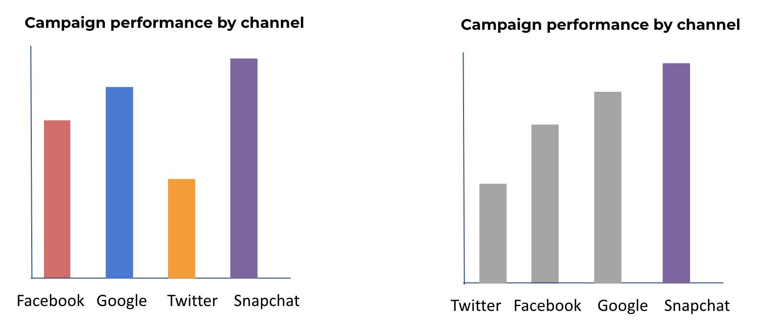
You can see in the example above; we placed the channels in ascending order so that the viewer can quickly see who the winner is. We’ve also even gone a step further and de-emphasized what’s not important to help the viewer’s eye get to the point even faster.
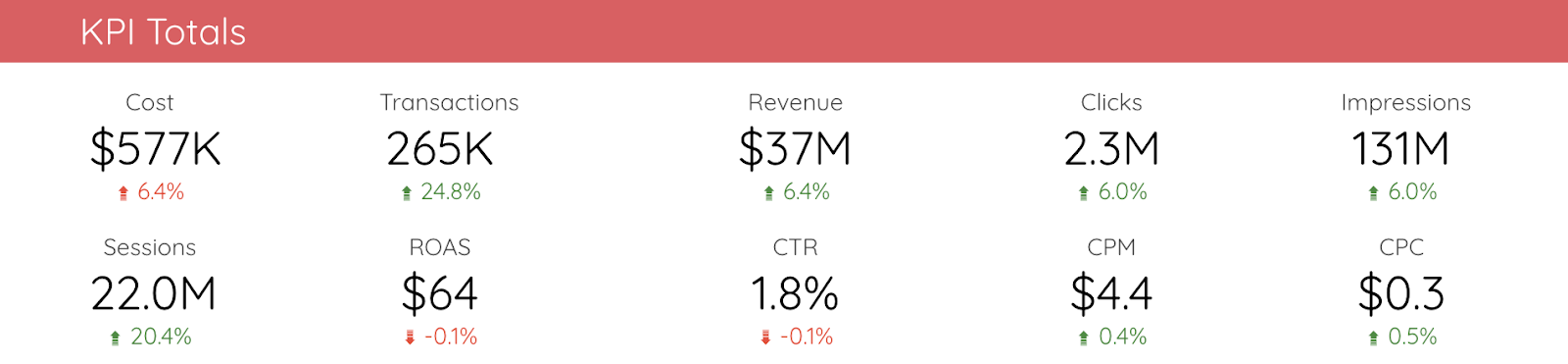
2. Adding a % change to your scorecard widgets can do wonders
Single number widgets like scorecards are great for highlighting those basic, need-to-know metrics. It lets you scan and get that high-level overview you need.
But how will you know if a metric is trending in the right direction? Is it performing better or worse than last week or month? Adding a % change to your widgets gives them a bit more context without someone having to check another chart, and maybe even do some manual work.
And to make the widget even easier for stakeholders to read and grasp the point, add conditional formatting, meaning make the % change red or green. This is a quick indicator for the eye to understand if something is going in the right direction or the wrong one and needs some attention.
Take a look at the scorecards in the dashboard below, and you can immediately see the value of % change and conditional formatting.
3. Avoid using dual-axis (or double y-axis) charts when you can
The concept of having two different values on your y-axis should already be a red flag that it won’t be easy to understand quickly. It takes the reader far too long to orient themselves on the graph; they have to try and figure out which line is which and what relates to what.
In short, it’s just too many things for the viewer to look at and understand. And, why do these things need to be in the same chart? What value does that bring?
Instead, separate them into two small charts and put them next to each other. It takes the same space, but trends or anomalies are easier to spot.
Datawrapper has an entire article dedicated to why you shouldn’t use dual-axis charts. If you ever find yourself tempted to use one, you should check it out. Or if you have a colleague who loves them and doesn’t understand why you’re annoyed.
Below is a great example from the article. Tell us how long it takes you to figure out what the chart is trying to tell you!
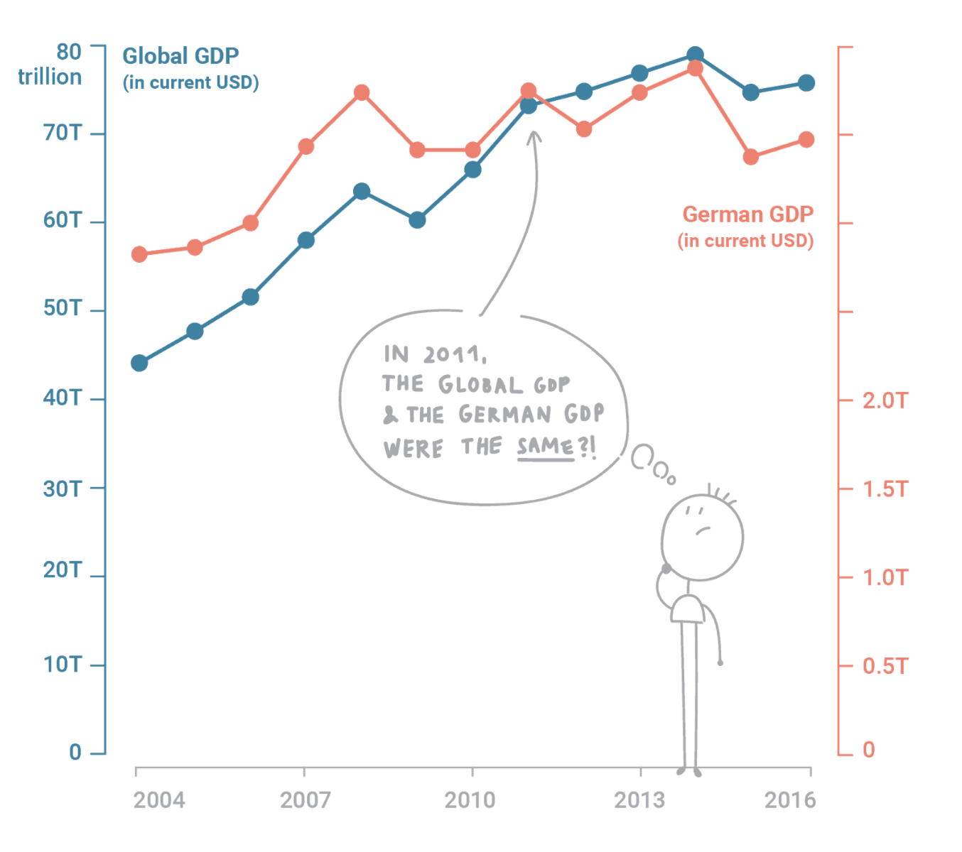
Source: Why not to use two axes, and what to use instead