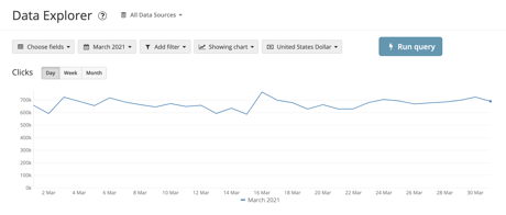
We want the Data explorer to be easy to work with. For this reason, we’ve updated the appearance and content of buttons and fields to better reflect their use.
The changes we've made in summary:
- The "Run query" button has been aligned with our design system, and always take a primary position. The other buttons in the toolbar have gotten a border to look & feel like other buttons.
- We've changed the copy of our chart button in the toolbar to "Show Chart | Hide Chart". We hope this will make it easier for you to locate and use our charting capabilities.
- Charts now have a heading (the field name) to explain what is graphed. The button group has been relocated to the right of the heading.
- We've removed the border bottom of the toolbar to logically group it with the content below.


