
Ever feel like you're missing something important in your marketing data? You're not alone. While most marketers get comfortable eyeing surface-level data insights, the real game-changing information requires a bit more digging.
Data insights aren't just numbers; they're the patterns that reveal opportunities in your strategy. The difference between good and exceptional performance often comes down to going beyond surface-level insights and looking for the hidden patterns — the relationships between data points rather than individual metrics, overlooked correlations, customer journey gaps and segment-specific opportunities. Your data already holds these secrets. You just need to know where to look.
The problem with surface-level data insights
Many marketers focus on surface metrics like clicks, impressions and likes. The problem is that these data insights don't tell the full story. Even when performance looks stable, something important might be going wrong.
Performance marketing expert Lee Riley learned this the hard way. While working for an e-commerce company, his team saw steady performance numbers, so they believed that everything was fine. But when he looked deeper after Apple's privacy changes, he discovered 90% of their budget was going to Android users who made up just 35% of their audience. A broken tracking integration had silently misdirected their spend for six months, likely wasting millions.
Hidden patterns like these only emerge when you connect data points that seem unrelated at first glance. Digging deeper could lead to new revenue opportunities, better campaigns and a clearer understanding of what your audience actually wants — insights you'd never find just looking at the surface.
4 data insights most marketers overlook
The most valuable insights hide between data points, not within them. Your metrics might track isolated performance, but the real story emerges in the connections. Spotting these relationships is what helps to reveal the insights you need to transform your marketing efforts for the better.
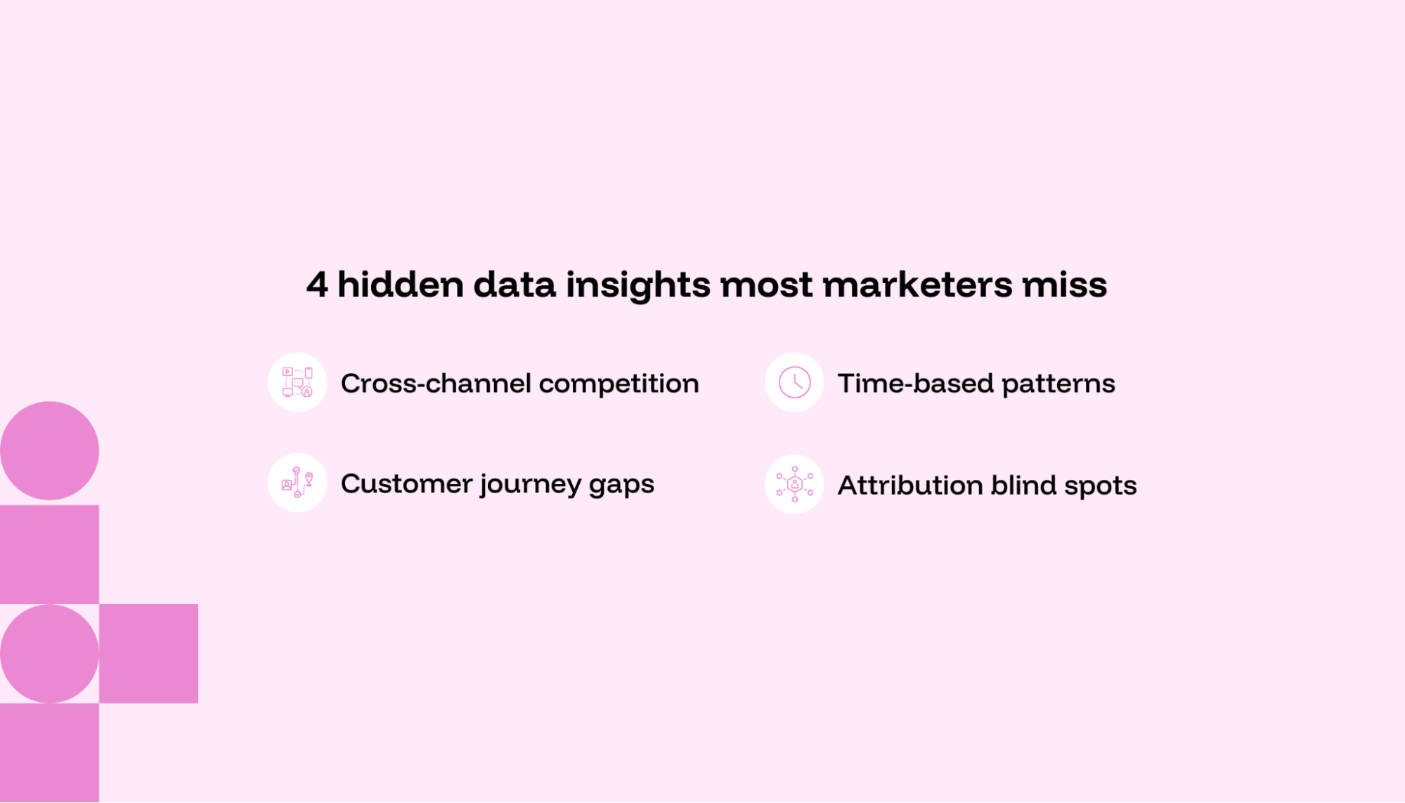
1. Cross-channel competition
When channels work against each other, your overall results suffer even if individual metrics look good. For example, a marketing director might see declining results despite improvements in conversions across each separate channel. Looking closer, they find their paid search is competing with their organic content. They're spending money on ads for the exact same topics that their organic content ranks for.
Once they noticed, they stopped running ads where their content already ranked well and put that money toward keywords where organic wasn't performing.
You won’t find this hidden insight if all you do is track trends across channels. You also need to look at how the channels interact.
2. Customer journey gaps
When users suddenly disappear from your funnel, the problem often lies between channels. These transition points from ad to website, email to landing page or event to sales demo could shed light on points of disconnect with consumers.
If you notice high email click rates but poor conversion numbers, for example, you might dig into your website user path and find a product comparison page, which is a major drop-off point. A heat map further shows visitors lingering and struggling with competitor comparisons because the information isn't structured the same way it was presented in the email.
Data consolidation is foundational to being able to find these data insights. You need to connect data across email and your website to even know this issue exists.
3. Seasonality and time-based patterns
When marketing performance fluctuates despite consistent execution, it might be a timing issue. These micro-seasonal trends (beyond obvious annual or quarterly cycles) might be hiding interesting insights.
Say a B2B marketing team notices inconsistent ad performance despite a stable monthly budget. They look at conversion data through multiple timeframes and see a pattern. One type of client in finance converts at higher rates during the third week of each month, which aligns with their typical budget review cycles. Manufacturing clients, on the other hand, engage more meaningfully in the final weeks of each quarter.
As a result, the team reallocates spend to these high-opportunity windows with messaging that addresses the specific pain points for each audience. Conversion rates improve.
4. Beyond last-click attribution
Limited attribution models usually fail to represent marketing’s full impact. These blind spots (whether in last-click or even multi-touch approaches) can hide important insights about your strategy.
Take a digital agency that’s struggling to justify its full-funnel marketing approach. Its attribution models give disproportionate credit to bottom-funnel tactics without visibility into how awareness campaigns influence conversions. So, instead, it tries triangulation to fill in the gaps.
Triangulation combines marketing mix modeling (MMM) to measure impact across channels but is supported by multi-touch attribution (MTA) for campaign insights and incrementality testing to validate uplift with experiments. They finally see display and social media create initial awareness that attribution couldn't track and that some conversions would have happened regardless of the final touchpoint.
How to uncover hidden insights in your data
Finding actionable insights is about asking the right questions, breaking down silos and using the right tools. This framework for uncovering insights will help you spot valuable patterns hiding in marketing data:
- Ask the right questions: Move beyond surface-level metrics to diagnostic inquiries that reveal why patterns exist. Shift from asking yourself, "What happened?" to "Why?" and "What next?"
- Combine data sources: Connect disparate data points to see the complete customer journey without fragmentation.
- Use data visualization tools: Transform numbers into visual patterns that reveal relationships invisible in raw data.
- Leverage predictive analytics: Apply forward-looking models to anticipate trends before they appear in your metrics.
Step 1: Ask the right questions
Any detective will tell you that blindly entering an investigation won’t work — you need to start with the right questions. When you spot performance spikes or dips, try to determine five reasons why. Rather than stopping at "Our conversion rate is 2.3%," dig into why visitors might be abandoning specific funnel points.
Actionable tip: The quality of your insights depends directly on the quality of your questions. Instead of accepting surface metrics, challenge assumptions by asking, "Why did this happen?" and "What does this mean for our strategy?" This investigative mindset turns routine reporting into discovery sessions that reveal hidden opportunities.
Step 2: Combine data sources
You want to start by consolidating all of your raw data under one roof. This includes data sources like your CRM, web analytics or ad platforms. It all needs to be in one place if you’re going to spot patterns across the customer journey.
For example, imagine wanting to understand why Facebook leads convert at lower rates than Google leads. To properly investigate this, you'd need visibility into each step, from ad click to sale.
You'd probably start by separately analyzing data from multiple systems: Google Analytics for website behavior, ad platforms for campaign metrics and your CRM for lead quality. Without a unified view, you'd struggle to make connections.
When all this data is integrated into one platform, you can see the complete customer journey from ad click to sale. For example, you might discover that Facebook traffic has high initial engagement but fails to convert traffic. These insights are impossible when data remains siloed across systems, as you can't connect pre-click behaviors to post-conversion outcomes.
A platform like Funnel makes this possible by connecting to over 500 data sources and normalizing your data automatically with well-maintained APIs.

Once you’ve connected all your data within a tool like Funnel, you can start looking for cross-platform trends. Visualization tools make spotting these patterns significantly easier.
Actionable tip: Create a unified data dictionary that standardizes naming conventions across all your platforms to ensure accurate connections between data sources. This foundation makes all your subsequent analyses more reliable and insightful.
Step 3: Use data visualization tools
Visual tools like charts, heatmaps and dashboards transform raw numbers into patterns you can actually see. Once your data is all in the same place, the right visualizations make it easy to see insights.
Your visualization should mirror how your marketing channels fit your customer journeys. For example, the path from Facebook ad to sale might look something like this:
- Facebook ad
- Webinar signup
- Website
- Demo
- Sale
To spot insights along the way, structure your dashboards in a way that’s easy to follow. Start with an executive dashboard showing sales outcomes, then link to channel dashboards displaying ROI metrics and finally to campaign dashboards with specific KPIs.
Once your dashboards are connected, you can watch for telling patterns like a performance line that consistently peaks one or two weeks after another or pattern breaks where metrics that are typically connected suddenly diverge.
For instance, visualizing lead generation and sales data side by side might reveal unexpected disconnects in your funnel. In the chart below, we can see that despite conventional wisdom that leads directly drive sales, the visualization shows no correlation between daily lead volume and daily sales performance.

Within your dashboards, choose the type of charts you create wisely to maximize your ability to uncover hidden patterns:
- Line charts work well for tracking performance trends over time, making it easier to spot seasonal patterns, unexpected spikes or gradual declines that might otherwise go unnoticed.
- Bar charts help you compare effectiveness across channels, clearly revealing which marketing initiatives are outperforming others by making size differences apparent.
- Avoid pie charts. They rarely reveal useful insights and often mislead because it’s difficult to compare areas when looking at the pie segments.
Apply different filters to your charts as an added tool to help you spot hidden insights. As you apply them, look for significant spikes or dips in trendlines and watch for diminishing returns that signal optimization opportunities.
For example, the visualization below shows how filtering by different date ranges reveals a dramatic performance difference. The left chart shows late November with a significant spike likely related to Black Friday promotions, while the right chart shows a different period with more consistent performance. This simple date filter exposes seasonal patterns that might inform when to amplify similar messaging or promotions.

If you’re working with Funnel, you can export your data to specialized visualization tools like Looker Studio or Tableau to build advanced heatmaps that reveal high-intensity activity clusters on a webpage or graph.

This example compares low engagement zones with high engagement zones based on location and may help to shed light on where marketing activities have been the most impactful.
Actionable tip: Create dashboard templates that follow your customer journey flow. Also, schedule regular "data discovery" sessions where team members actively explore visualizations, looking for unexpected patterns rather than just confirming existing assumptions.
Step 4: Use predictive analytics
You can also connect to tools that enable predictive data modeling for forward-looking insights. For example, you might send data you’ve automatically consolidated and normalized in Funnel to any of the following destinations:
- Python notebooks via Jupyter for custom prediction scripts
- R Studio for statistical forecasting that requires minimal coding
- Azure ML Studio to build drag-and-drop machine learning workflows
There, you can build reports that show predicted shifts in performance and compare those predictions against historical patterns to determine whether they’re significant. You’ll also be able to incorporate external factors like competitor actions or market changes.
For example, a predictive alert might show a declining conversion rate for the upcoming month. Maybe to dig a little deeper, you export conversion data by segment to identify which audience is affected. This approach shows that younger demographics will convert less because of declining engagement with specific creative assets. The hidden insight becomes clear: your younger audience will be tired of your creative in the next three weeks. This gives you time to address the issue proactively.
Predictive analytics works best when it combines human curiosity with technological capabilities. Your team's questions drive the models, while the technology provides scale and statistical reliability that would be impossible to achieve manually.
Actionable tip: Start with simple forecasting models focused on your most critical KPIs, then gradually expand to more sophisticated models as your team develops confidence in the results.
Real-world data insights success stories
The journey toward data-driven marketing begins with honest self-assessment. Before transformation can occur, you must be honest about your broken processes and fragmented data sources.
Regatta reclaims organizational trust in data
The Regatta Group was struggling with inconsistent marketing reporting. They were using different chart formats, KPIs and delivery schedules across regions, which made it impossible to compare results across markets. As a result, their teams didn’t trust the data that came across their desk.
A new director recognized the urgency of fixing this issue and started by implementing foundational tools. He connected Google Analytics 4 with BigQuery exports and used Funnel to centralize all data. Once all their data was under one roof, they automated the gathering and normalization process. This allowed them to build key performance dashboards in Power BI that focus on metrics that drive business performance.
As a result, the marketing team saved 16 hours a week previously spent on manual reporting. Their metrics became significant enough for board meetings and trusted enough to influence store location decisions. Their team’s trust in analytics rose dramatically once they could consistently access data.
Telia finds customer survey data to be misleading
Erik Werner, now a digital growth consultant at Funnel, found a revealing insight in his previous role at Telia while rebuilding their checkout experience.
The team needed to decide how prominently to feature financing options in their checkout process. Through surveys and interviews, 80% of customers said they preferred immediate payment over financing. The team designed the checkout accordingly, making financing a secondary option.
When they launched, actual behavior showed the opposite — roughly 80% of customers chose financing despite claiming otherwise in surveys. In reality, people tend to give rational-sounding answers in surveys, while actual decisions are influenced by context and emotions.
"This revealed a fundamental issue in user research: stated preferences often don't match revealed preferences," Werner notes.
This demonstrates how isolated metrics can be misleading. The most reliable approach would be to combine multiple methods like A/B testing, experiments and direct behavioral observations.
Turn your data into a goldmine with an investigative mindset
Extracting hidden insights isn't about getting more data. It's about adopting an investigative mindset. The most transformative discoveries happen when you approach your metrics with genuine curiosity rather than confirmation bias.
To uncover hidden insights, shift your mindset from reporting to diagnosing. Instead of asking what happened, dig into why it happened and what could happen next.
Ready to give it a try? Here are questions for four commonly overlooked patterns. Find the answers to these questions (or similar ones that relate to your data investigation), and find out what you can reveal.
Cross-channel competition
- Are any of my paid campaigns targeting keywords or audiences I already capture organically?
- Where do paid and organic conversions overlap most?
- Are we double-paying for those wins?
- What happens to conversions when I pause spend on top-performing organic topics?
Customer journey gaps
- Where do users usually drop off between two touchpoints?
- Do campaign messages and landing page experiences match in tone and content?
- Are we assuming a linear journey when users are actually bouncing across channels?
Seasonality and time-based patterns
- Which audience segments engage differently depending on the time of month or day of the week?
- Are there consistent spikes or dips that correlate with external events, such as holidays or budget cycles?
- Am I applying the same media mix every month despite different performance windows?
Beyond last-click attribution
- What marketing activities are getting undervalued because they don’t show up in last-click reports?
- Are we seeing assisted conversions that don’t get properly credited?
- If we removed top-of-funnel campaigns, would we still hit our targets?
What separates good marketers from great ones isn't better tools or more data. It's the courage to challenge what the surface metrics suggest. Let go of preconceived notions about what your numbers "should" say and embrace the unexpected patterns and data-driven decisions they could reveal.
Cultivate a culture that rewards this kind of questioning alongside data literacy. Your team will thrive when they feel empowered to ask the most insightful questions about the data they already have.
Start uncovering insight today with Funnel
Before you can uncover these gems in your data, you need to have everything cleaned and ready to go in one location. Funnel extracts data from hundreds of platforms, stores it securely and then prepares and aggregates it so it’s ready for your deep dives and investigative adventures. It also loads your marketing data to any data warehouse, spreadsheet, or BI tool with ease.
Ready to uncover insights you never knew existed? Start by getting all your data under one roof today with Funnel.