-
 Written by Sean Dougherty
Senior Brand Creative at Funnel, Sean has more than 15 years of experience working in branding and advertising (both agency and client side). He's also a professional voice actor.
Takeaway: The best Black Friday landing pages convert visitors and generate leads. Here are some of the most effective ways you can get better results from your landing pages this holiday shopping season.
Black Friday often helps define whether businesses have successful years. In 2022, e-commerce stores raked in $9.12 billion in Black Friday sales. And that only includes revenue earned on Black Friday. Online stores earned even more money — about $11.2 billion — on Cyber Monday.
Not surprisingly, businesses face incredible competition during this shopping holiday. How will you stand out from competitors that dangle Black Friday deals in front of your customers, hoping to lure them away?
Black Friday campaigns involve a lot of planning and research. This year, use a Black Friday landing page that converts more visitors into lifelong customers.
It’s OK if you don’t know how to design and promote a Black Friday landing page that converts more people. We’ll introduce you to critical aspects of the process that will boost your Black Friday sales through a dedicated landing page.
Introduction to Black Friday landing pages
Landing pages are at the top of your sales funnel, so they can help you attract more business at any time of the year. They become even more important as sellers become more aggressive as they push their Black Friday deals.
Many marketers put landing pages at the center of their campaigns. Your performance marketing, content marketing, and website optimization all intersect on the landing page. If you can direct more traffic to your Black Friday landing page, you have opportunities to:
- Educate more people about your brand and product.
- Collect data specific to your campaign for the holiday shopping season.
- Capture information about visitors so you can target them in the future.
- Direct visitors to Cyber Monday deals in addition to your Black Friday promotion.
- Expose visitors to other product pages that might interest them.
It isn’t enough to have a good landing page. Not on Black Friday! You need to get as close as possible to a perfect landing page that will bring more traffic to your web page and convert more visitors into paying customers.
Understanding conversion-centric design for your landing page
Conversion-centric design – also called conversion-centered design – specifically focuses on converting more visitors into customers.
When designing a Black Friday landing page:
- Limit distractions that could hurt your page’s attention ratio. (Basically, you don’t want a busy-looking page to confuse visitors.)
- Focus on a single goal. It’s often better to stick to the benefits of your Black Friday deals instead of trying to boost future sales. Although, you might make an exception for Cyber Monday deals.
- Establish an information hierarchy that puts your most important info at the top of the page and concludes with a powerful CTA.
- Use a consistent design for all of your Black Friday landing pages. Using the same colors, fonts, styles, and other assets across your Black Friday landing pages helps establish a trustworthy brand identity. (You can take this concept even further by reusing creative assets in other parts of your Black Friday marketing campaigns, including emails, social media posts, and advertisements.)
- Clearly state the benefits of choosing your company. Don’t expect visitors to decipher it for themselves. They might not reach the conclusion you want!
Key elements of high-converting landing pages
It’d be really easy if you could just include every possible element to your Black Friday landing page. Realistically, though, you have to make some important decisions. Otherwise, you risk overwhelming potential buyers, which will just send them in search of different Black Friday deals.
If at all possible, add the following key elements to your Black Friday landing pages:
- Catchy headlines that emphasize the benefits of buying from your business.
- Subheadings that further explain what buyers can expect from your products and services.
- Attractive, professional images that inspire confidence in buyers.
- An eye-catching call to action button that makes it easy for shoppers to finalize their purchases.
Mobile responsiveness and page speed
Search engines typically reward websites that use mobile-first and responsive designs that conform to diverse screen shapes and sizes.
Strong SEO isn’t your only reason to build Black Friday landing pages optimized for mobile devices. When it comes to shopping, more U.S. adults rely on their smartphones than their desktop or laptop computers.
Every age group — except for 65+ — prefers shopping on smartphones.
You also need to pay attention to the loading speed of your Black Friday landing page. Search engines give higher rankings to sites that load quickly.
A slow page load time will also increase your bounce rate. If your Black Friday landing pages have load times between one and three seconds, you can expect a bounce rate of around 32%. If it takes five seconds for your Black Friday landing page to load, the average bounce rate jumps to 90%.
The numbers only get worse from there.
The lesson is obvious: make mobile-responsive landing pages that load quickly. Those steps will position you for success on Black Friday and beyond.
Improving slow loading speeds
What if you have a slow Black Friday landing page? You can take a few steps to boost its speed.
Perhaps most importantly, limit the amount of JavaScript your page uses. JavaScript can create interactive experiences, but it also takes time to load the code. Use it, but use it sparingly.
Similarly, don’t go crazy with your cascading style sheets (CSS). When possible, rely on native text fonts built into most web browsers.
Limit the number of HTTP requests by enabling browser caching. That way, repeat visitors won’t need to load data-heavy assets again. The images, videos, etc., get saved in their browser.
Avoid data-heavy images, videos, and other content. Too many large images will slow your loading speed to a crawl. You want to use great images, but you don’t want to force your website host and your visitors’ web browsers to do more work than necessary. If you can get good results with JPEGs and WebPs, use them instead of GIFs and PNGs.
Building trust and credibility
Today’s consumers have a healthy distrust of company claims, so you need to earn their trust before you can earn their dollars.
Adding social proof — such as customer testimonials, product reviews, and ratings from third-party sites — to your Black Friday landing page shows potential buyers that other people have enjoyed buying from you. Make testimonials even more effective by including a small image of someone next to the quote. (You should always use real testimonials from real customers, but it might make more sense for you to use professional photographs instead of asking people for selfies.)
Displaying security credentials on your Black Friday landing page could also make people feel more comfortable shopping on your site. Some of the most effective Black Friday landing pages will display images for:
- Secure payment processing with encryption and Secure Socket Layer (SSL) protection.
- The payment options your web pages can accept, such as Visa, PayPal, and Apple Pay.
- Free returns for any reason.
- Money-back guarantees.
- Endorsements from third-party organizations like the Better Business Bureau, Google, and Amazon.
Creating a sense of urgency
Black Friday sales don’t last long, so many of your landing page visitors will already feel some sense of urgency.
Countdown timers
You can increase the excitement around your deals by adding countdown timers to your landing pages. At the top of your page, add a timer that counts down to the second your Black Friday sale starts. Once it starts, change the timer to show how much time shoppers have to take advantage of your holiday sales, discount codes, exclusive deals, and other perks.
Showcase limited stock availability
Dr. Robert B. Cialdini identifies scarcity as one of his six principles of persuasion. If you haven’t read Cialdini, get a copy of Influence: The Psychology of Persuasion. He’s a master of influencing consumers.
You can incorporate the concept of scarcity into your landing page by showing how many items your online store still has.
As the stock of your holiday exclusive deal dwindles, display the remaining number of items. Interested buyers will feel a little more eager to grab the remaining stock so they don’t miss out.
Simplify navigation and minimize distractions
Keep your Black Friday landing page as simple as possible so first-time visitors will intuitively know how to navigate the content. A messy design with too many visuals will distract visitors. You want them to focus on learning about your product and finalizing a purchase. That doesn’t happen when they have to waste time figuring out how to navigate the landing page.
It only takes a little frustration before people leave your site to take advantage of someone else’s Black Friday campaign.
How can you simplify your landing page’s navigation? Try to:
- Use white space to highlight key elements that communicate meaningful information.
- Eliminate clutter from your design. If something doesn’t add value to your landing page, remove it.
- Limit the number of links on your landing page to keep people focused.
A/B testing and optimization
You should make more than one Black Friday landing page for each product or deal you offer. The landing pages will look similar and say similar things — but in slightly different ways. This gives you the opportunity to conduct A/B testing.
A/B testing in landing pages helps you determine which version gets the best results from your target audience. If version A converts twice as many visitors as version B, you can start sending more visitors to A to generate higher sales.
Often, one page won’t stand out as the clear winner. Some aspects of each page, however, could be more effective than others.
Track how people interact with your landing page to determine which key elements get results. You might find yourself mixing aspects of different pages throughout your Black Friday sale. Don’t expect your landing page to do all of the work for you. You’ll get a more effective design by collecting data and optimizing pages.
Related reading: Unexpected forms of A/B testing
Optimized form design
No one wants to fill out a long form with a dozen required fields. Give potential customers an easy way to submit their orders, contact information, and payment info.
Look at forms on your Black Friday landing page and consider whether you want to complete every field. If anything seems unnecessary, remove it to optimize the form’s design.
Additionally, set your form so the customer’s web browser can auto-complete as much information as possible. Black Friday sales look much more tempting when you don’t have to fish around in a purse or wallet to find your credit card number.
Integration with email marketing
A good landing page won’t convert every visitor. That doesn’t mean it can’t increase sales in the future!
Add a short lead generation form that lets visitors give you their email addresses. Then, you can continue interacting with them after the holiday shopping season. You can also use their contact info to build an email list for next year’s Black Friday email campaign.
Make sure you entice people to give you their email addresses. Few of them will do it without reason. Sending a one-time coupon code could encourage some of your landing page visitors. You could also promise ongoing promo codes to save them money throughout the year.
Related reading: Score the best shoppers with these Black Friday email marketing tips
Post-conversion engagement
Amazing landing pages do more than convert visitors into buyers. They encourage post-conversion engagement that leads to more sales in the future.
Post-conversion engagement can include:
- Redirecting customers to a different Black Friday sales page that might interest them.
- Sending emails or text messages to confirm orders.
- Encouraging people to share their purchases on social media channels used by your target audience.
- Offering bonuses for referring new customers to your site.
Tracking and analytics
You might need to adjust your landing page design to improve results. Tracking and analyzing data will show you what page elements to emphasize and which ones to remove.
Some of the most important metrics to track include:
- Conversions
- Sessions by source (internet search, an advertisement, social media post, etc.)
- Bounce rate
- Average time on page
- Page views
- Pages per session
Some tools that can help you track and analyze data include:
- Google Analytics
- Optimizely
- Adobe Target
- Crazy Egg
- Unbounce
Case studies and examples
Looking for inspiration to make your Black Friday landing page more successful? Check out these examples from 2022.
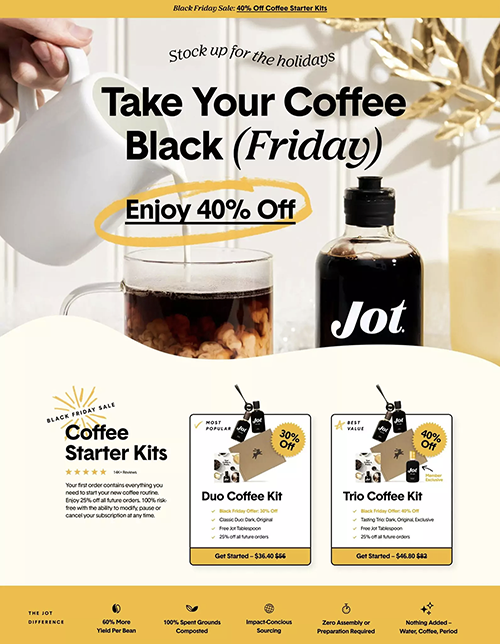
Jot Coffee
Jot Coffee’s Black Friday landing page did a lot of things very well. It:
- States the Black Friday deal very plainly (“Black Friday Sales: 40% Off Coffee Starter Kits”).
- Displays the product in an attractive, professional way.
- Uses a little joke to interest visitors (“Take Your Coffee Black (Friday)”), which isn’t easy to pull off.
- Shows social proof with a five-star rating and customer review.
- Succinctly explains the benefits of choosing Jot products and services.
- Offers alternative Black Friday deals that might interest visitors.
Example taken from Shogun
Nguyen Coffee Supply
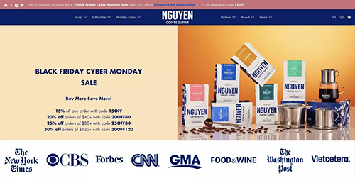
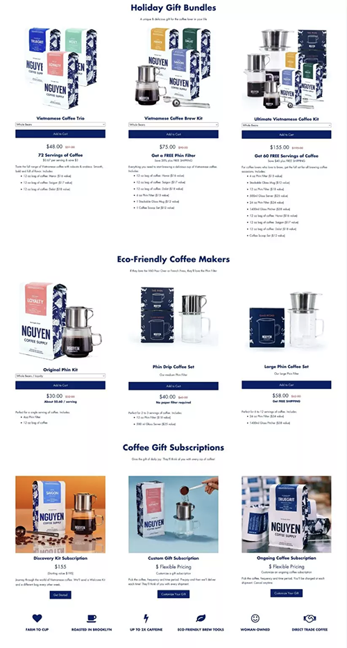
Let’s look at another coffee company that had a great Black Friday landing page. Nguyen Coffee Supply’s landing page:
- Shows precisely how much buyers can save with their Black Friday discount codes.
- Displays Nguyen coffee and related supplies.
- Emphasizes that the products have been reviewed by trusted sources (Forbes, Food & Wine, The Washington Post, etc.).
- Directs visitors to landing pages for other holiday gift bundles.
- Gives three visual images to show visitors how to brew the best coffee.
- Covers the benefits of buying robusta coffee beans from Vietnam.
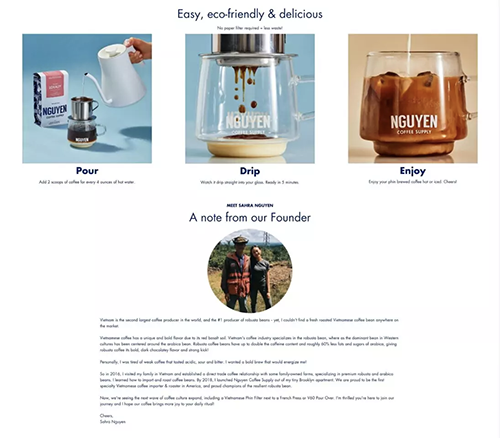
Example taken from Shogun
Get the most out of your Black Friday landing page
Optimizing your Black Friday landing pages could help boost your sales during the holiday shopping season, generate more leads for future campaigns, and increase your brand recognition long after the holidays end.
Remember to use engaging CTAs, balanced designs people can navigate easily, and evidence that you have a terrific product. Then, track your data to keep optimizing your pages for further success.
This Black Friday is your time to shine.
-
 Written by Sean Dougherty
Senior Brand Creative at Funnel, Sean has more than 15 years of experience working in branding and advertising (both agency and client side). He's also a professional voice actor.
