-
 Written by Sean Dougherty
Senior Brand Creative at Funnel, Sean has more than 15 years of experience working in branding and advertising (both agency and client side). He's also a professional voice actor.
When creating ads for a B2B audience, there’s a good chance those ad creatives will end up on LinkedIn at some point. After all, LinkedIn is one of the world’s largest business-focused social networking sites.
At the same time, any good marketer worth their salt also knows that a good concept needs to be adjusted to each execution and ad platform. So, how do you adapt your ad creatives specifically to LinkedIn in a way that grabs attention and drives results?
Not to fear; we’re here with five amazing LinkedIn ad creative tips to save the day! We even have some examples of great creatives to inspire you.
Five tips for more powerful LinkedIn ad creatives
While these tips are impactful enough to stand on its own, it’s also important to follow them almost as a step-by-step process. Let’s go!
1. Be clear with your goal
Any good ad creative, and any good brief, starts with a clearly defined goal. Your LinkedIn ads are no different. For instance, are you using your the Linkedin Ads to drive lead generation, direct web traffic, increase on-platform engagement, build brand awareness, or do something else entirely?
While these options might seem nuanced, the effect on the final creative could be quite stark. Let’s use the goals of on-platform engagement versus brand awareness as an example.
They may seem similar at first glance. After all, engagement on social media can sometimes be used as a barometer for brand awareness and brand health. However, in the context of an ad creative, this can be a pretty large fork in the road.
Engagement vs brand building vs conversion
A LinkedIn ad creative that drives engagement will have distinct calls to action that invite liking, sharing, commenting, and more. It may feel a bit more “lo-fi” or user-generated. Meanwhile, a LinkedIn ad that positions your brand and builds awareness may be more polished. Finally, a conversion focussed LinkedIn Ad may feature more indirect calls to actions — say, visiting a website to learn more.
The goal of your LinkedIn Ads will also inform the ad format. Video may be good for brand building, but lead gen ads are better for lead generation.
The point is, if you don’t know where you’re going (i.e. your intended goal), it’s hard to determine the best path to get there.
2. Use a captivating image
While LinkedIn may be the most business-oriented of the major social media platforms, it still relies on an endlessly scrolling feed. As such, you need to use striking images that grab users' attention and cause their scrolling to stop immediately.
You know that old adage about a picture being worth a thousand words? That goes double in an advertising context, and triple on social media. Especially if you are going for single image ads on LinkedIn, that image is super important.
To be sure, your imagery selection needs to align with your brand, but it still needs to be bold. Imagery that is generic (*cough*, stock imagery, *cough*) or boring won’t register in consumers’ minds.
.png?width=504&height=422&name=Obvious%20(1).png)
Stock photos can be used, but make sure to pick one that is likely to grab peoples attention. Stock photos that are too generic will not work. (Both photos come from Pexels).
Combining the image with text
The visual appeal of your ad isn’t limited to your imagery either. Cramming your LinkedIn ad creative with too much copy can also reduce the visual impact. You only have so many pixels to play with in a LinkedIn ad, so real estate is at a premium. And while we’re on the topic of ad copy…
3. Craft the perfect “visual headline”
Once you’ve stopped a user’s scrolling with your incredible imagery, you have a mere moment to deliver a powerful marketing message. This message must clearly identify that this ad is directed specifically to the individual viewer, be easily legible, work visually with the rest of the creative, and deliver a message that will drive action. All in a couple of words.
It’s no easy feat. You get one chance to deliver one message. Yes, a single message. You need to make it count.
Shorter headlines are often preferred as this allows the copy to become larger within the layout. Concise copy is also less likely to distract from the visual, and it’s easier to work into the overall design.
Crafting a compelling LinkedIn Ad headline:
- Benefit and Value: Highlight how the user will benefit from your product or service and the value it provides.
- Brand Inclusion: Mention your brand in the headline to build awareness and trust.
- Product Highlight: Be sure to mention the product or service that delivers the benefit and value.
- Conciseness: Aim for a short, easy-to-read headline that quickly gets to the point.
- Testing: A/B test your headlines to see which ones perform best. Use this data to refine your headline writing over time.
(Can you feel the writer’s block setting in? Don’t worry; we have some examples below that can serve as inspiration.)
4. Educate your audience
Since the platform caters largely to a B2B audience, your LinkedIn ad creatives should educate your audience somehow. Put yourself in the shoes of another professional on the platform.
At Funnel, we know from our research that many LinkedIn users are using the platform to learn more about their field of work. For instance, marketers may be curious if other professionals are also confused when analyzing marketing data.
LinkedIn carousel ads are a great format to inform your audience in a dynamic and engaging way. Plus, educational content can serve to position your brand long-term. But again, go back to that brief and confirm the goal. Then, hone in on your educational elements to suit.
5. Use multiple ad styles
Particularly when you first start advertising on a platform, it behooves you to test multiple formats. We’re not just talking different sizes either. We’re talking about different media, too.
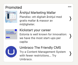
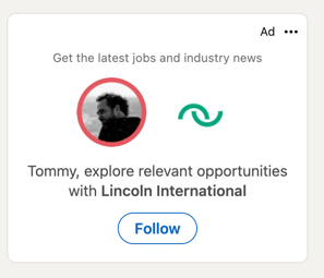
For instance, we find that videos are a great way to build brand awareness. Carousel ads are great at driving engagement thanks to their click-through nature. Text ads and spotlight ads can also be useful for cheap, incremental increases in brand awareness — they don’t get many clicks, but that allows you to rack up impressions for little spend.
You can see an example of a text ad (left) and a spotlight ad (right) below.
Some other Linkedin Ad formats you should know about:
Lead Gen Forms:
Lead Gen Forms simplify lead collection. When users click these ads, a pre-filled form pops up, making it easy for them to share their details.
Dynamic Ads
Dynamic Ads personalize ad content using a user's LinkedIn profile data. They aim to create a more personal connection and can lead to higher engagement.
Carousel Ads
Carousel Ads let you showcase multiple images in one ad. Users can scroll through the images, creating an interactive experience that can drive engagement.
Follower Ads
Follower Ads, a type of Dynamic Ad, are used to increase your company's follower base on LinkedIn. They're displayed to LinkedIn members who aren't yet following your company page and encourage them to do so.
Great LinkedIn ad examples
Ok, now for the part you’ve been waiting for. Let’s look at some awesome examples of LinkedIn ad creatives and break down what makes them effective. For each example, try to look at the entire ad as a whole first. Then, see if you can identify where your eye is initially drawn.
1. Media.Monks
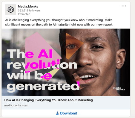
This is a great example of using the human brain’s preference for identifying faces as a catalyst to capture your attention. The combination of odd shapes with neon colors are intended to slow a user’s scrolling.
However, once you’ve stopped, your eye is probably drawn to the right eye (his right, your left) of the man in the image, which is from another model. You then move down and to the left toward the bright pink “AI.” The eye, then, continues down until you either reach the sub-head at the bottom or jump to the caption above.
The ad is directing you to a piece of content about how AI is disrupting the marketing industry. As such, the creative is designed to attract marketers. The visual elements are bold and striking (while also on brand for an agency like Media.Monks).
The visual headline is powerful, speaks to the content of the report, and doesn’t obstruct the visuals. In fact, the headline becomes part of the visual aesthetic.
2. Monday.com
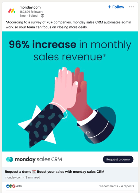
Who doesn’t love a great high five? These two hands bursting through the background to celebrate are designed to stop your scroll. The bright colors and “simple” graphic elements help to create impact and quickly transition your eye to that big, bold number.
The visual headline features a bold statistic that speaks directly to sales and revenue professionals. The boldness of the stat makes certain that your eye catches it. The asterisk then points you upward to the caption with further detail.
While the headline isn’t as much of the design as in our Media.Monks example, it does play a role in guiding the eye around the ad.
Designed for lead generation, this LinkedIn ad example also features the call to action to request a demo, leaving no doubt what the viewer is supposed to do.
3. Storykit
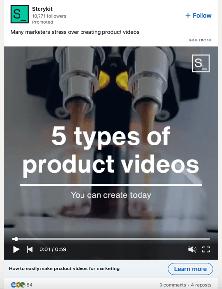
This video ad promotes Storykit’s capability to help marketers easily create product videos. So, it’s like a product video about product videos. Very meta, or video “inception.”
The ad highlights five different types of product videos themes and provides tips on how to execute them. Thus, it checks the box for educating its intended user.
Additionally, video remains one of the most compelling mediums on social media. It’s a great way to capture attention and also carries a higher probability to stop a user’s scrolling.
The initial copy at the beginning of the video is short and to the point. It also features a clean layout that isn’t overpowering. And for those of you who have clicked the link to watch the ad on YouTube, did you notice the backing music?
When creating video ads, audio elements like music, voice over, and sound design can help to deliver multiple brand layers. Just keep in mind that on social media sites like LinkedIn, many users mute their devices. You may want to consider using subtitles if your video ad features narration.
In the case of this Storykit ad, it was likely created specifically for LinkedIn, since the main messages are delivered through text overlays without any voice over. The music is also simple and not intrusive. In other words, if a user is watching the video on mute, they aren’t missing anything crucial.
A side (but very important) note
It should be pointed out that these LinkedIn ads (particularly the first two) intentionally make use of diverse representation. While sometimes overlooked, it is a major consideration for many ad designers and copywriters. Many marginalized voices and faces can breathe new life into advertising, and it’s important that those perspectives be included, recognized, and given a chance to shine.
Putting it all together
Building a winning LinkedIn ad creative requires artistic expertise as well as data-backed strategies. However, by following these five tips, you will be well on your way to creating the next stand-out creative for the platform.
And who knows, we may soon be writing about your incredible creatives as an outstanding example of how to make ads that perform on LinkedIn.
-
 Written by Sean Dougherty
Senior Brand Creative at Funnel, Sean has more than 15 years of experience working in branding and advertising (both agency and client side). He's also a professional voice actor.
