
The best marketing performance dashboards can deliver stunning visualizations that clearly highlight critical insights while also telling a compelling story.
Those powerful dashboards don’t just build themselves, though. In fact, if the underlying data isn’t managed and organized properly, the outcome can be confusing or misleading graphics.
So how can marketers ensure that their performance dashboards are using high-quality data? The answer is to identify your mess, tidy it up by categorizing your data, and ensure that your data follows uniform formatting.
Why performance marketing dashboards are important—and why they’re so hard to get right
Performance dashboards promise a lot: real-time insights, clear ROI, and faster decision-making. In theory, they help marketers steer the ship with confidence. In reality? Many dashboards end up cluttered, confusing, or collecting dust.
That’s because building a genuinely useful dashboard isn’t just about plugging in data—it’s about aligning on what matters. It means asking the right questions, choosing the right metrics, and designing views for real human beings with different needs: from paid media specialists optimizing bids to CMOs presenting boardroom slides.
It’s easy to build a dashboard. It’s hard to build one that changes behavior.
In the next sections, we’ll explore how to do just that—with practical best practices, real-world templates, and answers to the questions marketing teams ask every day.
.png?width=1200&height=460&name=dashboard%20(1).png)
Best practices for building effective marketing performance dashboards
To build a dashboard that delivers true marketing intelligence—not just vanity metrics—follow these golden rules:
1. Start with business goals, not data availability
Don’t build a dashboard around what you can measure. Build it around what you should measure to drive strategic decisions.
2. Use triangulated metrics
Instead of fixating on one source of truth, combine multiple methods of measurement to spot trends and outliers. Attribution isn’t absolute—it’s directional.
3. Tailor views to specific audiences
Executives want ROI and growth signals. Channel managers want levers and performance trends. One dashboard rarely fits all—build purposefully.
4. Focus on clarity over complexity
A beautiful dashboard makes insights obvious. Use consistent colors, intuitive layouts, and minimize noise. If someone needs a manual to interpret it, you’ve gone too far.
5. Update in real time (or close to it)
Timely data fuels confident decisions. Aim for automation so you’re not stuck in spreadsheet land on Monday mornings.

How to build a performance marketing dashboard that really works: in three steps
Step 1: Identify the data journey
You can’t hope to properly organize your data without understanding the pipeline it travels through. Like any road trip, your data’s journey is composed of its source, any marketing data hubs it passes through, the visualization destination, and the final marketing performance dashboard.
At each of these points, data is being processed either by software or by human hands.
Attribution of marketing campaign performance
For example, the software you use will make assumptions about the raw data at the ad platform level by attributing conversion to traffic sources as organic versus an ad campaign. Google Analytics also does this.
However, if you step back and think about it, where exactly is that line being drawn? That conversion may have originally arrived at the site or come into contact with the brand through organic means. This could have happened several times. Then, they may have interacted with an ad, which finally pushed them over the edge into a converted customer.
Surely, this conversion can be attributed to the ad (and the ad platform will certainly try doing that). However, organic efforts and above-the-line marketing efforts should also be receiving attribution at some point.
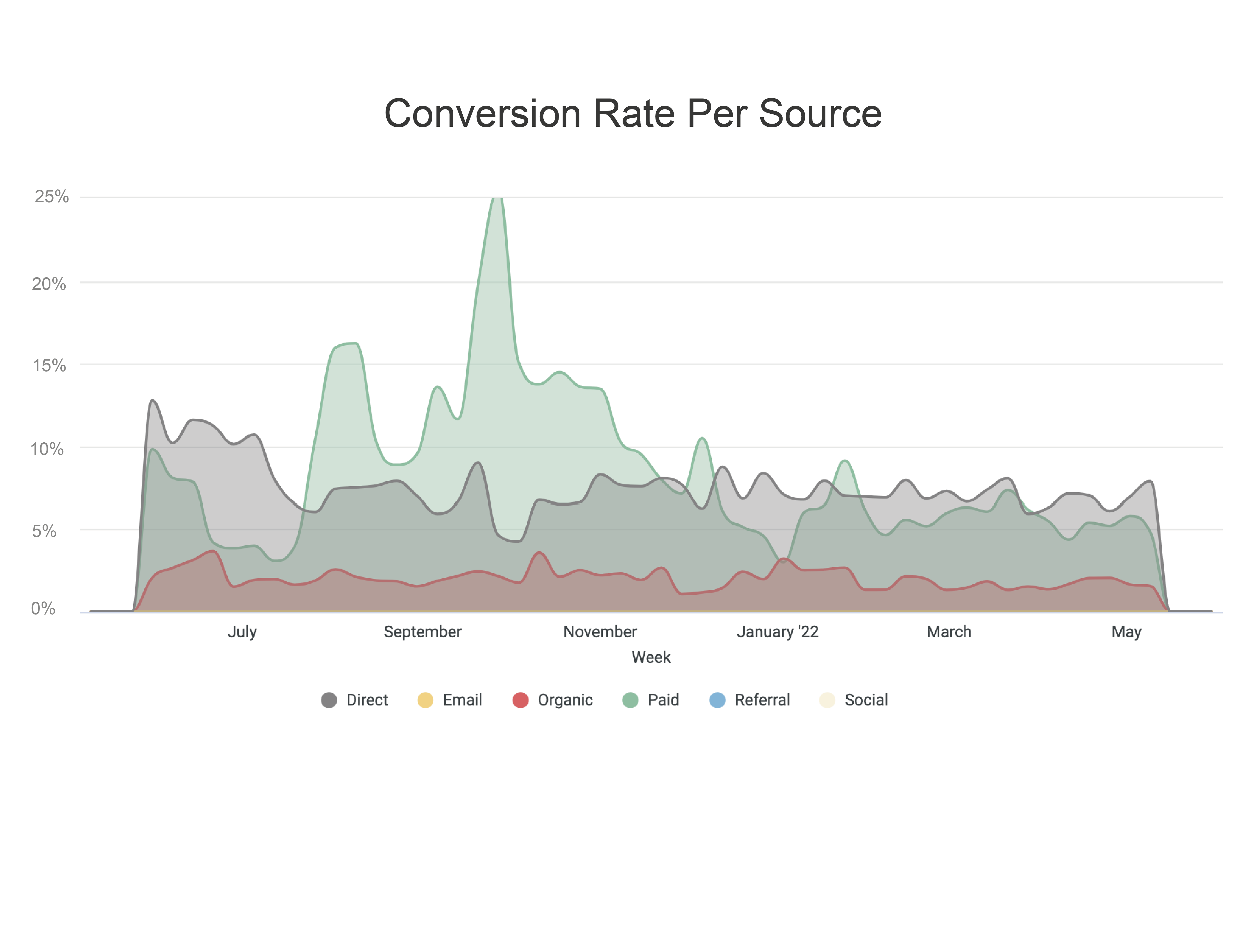 It’s important to ensure that you, the marketer, know where this attribution line is in your customer journey. You may want to invest in an attribution tool, or (as we point out in the video below) you could be trying to identify contribution rate on an aggregate level. Otherwise, your marketing performance dashboards may be giving an outsized portion of “credit” to the digital ad spend, when that’s actually just one piece of a much broader picture.
Step 2: Data transformation (with a human touch)
'Human users can also have a major impact on your data’s journey to its dashboard destination. Once data is collected from multiple platforms and is sent to a marketing data hub, it likely needs to be transformed or “cleaned”. Only then can you use it in a digital marketing dashboard in Google Data Studio or another visualization tool.
Consider this: if you are running an ad campaign across Google, Facebook, and LinkedIn, the formatting of certain data points may not match up perfectly. Items like currency, numerical values, time zones, and more may each be treated differently across the different platforms. They may also use slightly different names for certain metrics and dimensions (i.e. one platform calls it “spend” and another calls it “amount spent” or "cost").
Use the right name & format for metrics and kpis
If you want to build an effective marketing performance dashboard, you’ll need to make sure that all of the data is speaking the same language. Especially if your dashboard contains important key performance indicators (which is likely the case) this is important.
Take numerical formatting, for instance. Your visualization tool may not recognize formats from other countries. To illustrate this, let's compare ad spend in the US and Sweden. On the first line in the table below, you see the raw values for each country in native currency. In line two, the Swedish Kronor has been converted to US dollars.
However, if you sent this information to your visualization tool, you would likely be given a broken report. That’s because, in Sweden, a comma is used in place of the decimal point. Plus, Sweden uses a space rather than a comma to delineate factors of 100 (thousand, million, billion, etc.).
| Sweden | USA |
| 1 250 000,00 SEK | $1,748,500.00 |
| $125 426,00 | $1,748,500.00 |
This problem might not only occur with monetary values, but also with date annotations. For instance, the US uses Month-Day-Year, while a large part of Europe use Day-Month-Year.
Transforming your data and ensuring your data is organized consistently for all platforms is a critical step in making sure your marketing performance dashboards are stable, reliable, and delivering accurate insights.
There is still one critical step of our data organization checklist that has a major impact on your overall dashboard.
Step 3: Group and categorize your data strategically
As we recently covered, it is crucially important to consider the makeup of your audience when building dashboards and digital marketing reporting. Effective presenters understand that they should curate which content makes it into a given dashboard, and (depending on the story being told) which KPI will be given prominence.
This leads us perfectly, then, into how we consider the organization of those dashboards.
Are your visualizations based on time? Are they displaying the performance on different platforms alphabetically or by volume?
You may think it is always the best option to arrange your data in a graphic in ascending-to-descending order, that may not always be ideal. For example, if you are comparing three metrics for all of your ad platforms in consecutive or side-by-side graphics, then it may make sense to list the platforms alphabetically. This way, the reader can make quick visual comparisons.
Examples and dashboard templates
You can find a whole host of premade, ready-to-use dashboard templates over on our quick start gallery. All you need to do is create a free account and connect your sources. Why not start with our performance marketing dashboard, which has custom fields and brings all your data into one place for an on-the-spot overview of your performance marketing efforts.

Need more inspiration? Here are a few common types of marketing dashboards we see successful teams using:
1. Executive overview dashboard
-
KPIs: CAC, ROAS, revenue by channel, marketing-sourced pipeline
-
Updated weekly or monthly
-
Clean, high-level, and ROI-focused
2. Channel performance dashboard
-
KPIs: CTR, CPM, conversions, spend efficiency
-
Includes platform-level breakdowns (Meta, Google, LinkedIn)
-
Perfect for weekly optimization stand-ups
3. Campaign performance dashboard
-
KPIs: Impressions, engagement, conversion rate, cost per lead
-
Often includes creative-level insights
-
Ideal for short-term sprints or post-mortems
4. Funnel diagnostics dashboard
-
KPIs: Lead velocity, drop-off rates, MQL to SQL conversion
-
Helps pinpoint friction points in the buyer journey
-
Great for RevOps alignment
Bringing it all together in your marketing dashboards
Your marketing performance dashboard is likely broken down into different sections. That means you need to make decisions about what those sections are and what data sets are relative to that section. Organizing your visualizations into the correct sections will help your dashboard more effectively tell a cohesive story.
While it can be a bit easy to go deep “into the weeds” when you’re trying to organize your data, it’s important to keep in mind what purpose this organization will serve:
- Organizing your data at the beginning of the pipeline helps to ensure it’s on a path to successful reporting.
- Transforming data ensures that your visualizations accurately represent all data collected.
- And strategically categorizing your data across your reporting and marketing performance dashboards helps ensure you are telling a great story through your data.
Combining all three steps ensures that you are presenting insightful visualizations that have the power to positively impact the business. You will draw the right conclusions, because the data is solid. And this will make it easier for you and the marketing team to make the right decisions for your marketing strategy.
Key takeaways
-
A good dashboard doesn’t just show data—it shows direction.
-
Design for the decision-maker, not the data analyst.
-
Combine metrics and methodologies to build a complete picture.
-
Real-time, reliable dashboards remove the guesswork.
-
Templates help, but tailoring makes the difference.
FAQs
Q: What’s the difference between a report and a dashboard?
A dashboard is live and interactive. A report is static and retrospective. Dashboards are for navigating. Reports are for documenting.
Q: How many dashboards do I need?
Start with one per key audience: leadership, marketing ops, and channel managers. More isn’t better—relevance is.
Q: Can I use Funnel to build dashboards?
Yes! Funnel integrates your data, harmonizes it, and sends it to Looker Studio, Power BI, Tableau, or wherever you want to visualize. We don’t just help you build dashboards—we help you build trust in your numbers.
Q: What KPIs should I include?
Think beyond clicks. Align your KPIs with pipeline, revenue, and efficiency. And if you’re stuck, our team can help.