

Our ability to craft and communicate stories is one of the most important things that make us human. Whether it’s story time in school or tales told round a campfire, we all have strong memories of receiving stories.
Just like those universal examples, data storytelling is an incredibly important and vivid element of presenting your results. A good data story can make complex ideas understandable, assist in uncovering key insights and inspire action.
“But wait,” you may say. “Isn’t data visualization at the heart of presenting data?”
Well, yes. But data storytelling… it’s, well… more. Let us explain.
What is data storytelling?
Data storytelling is the art of using data visualizations to craft a narrative that triggers emotion and drives action. It turns raw data into a compelling data story, making it more engaging and resonant with the audience.
Successful data storytelling looks like:
- User-friendly insights
Clear and concise narrative that doesn’t need a data science degree to understand. This could mean using visuals like graphs or infographics. - Audience relevance
Data stories aren’t just about analyzing data – they’re about what those numbers mean for the people listening. - Persuasive insights
The goal of a data story is to inspire action. A data-storytelling culture can create a motivational buzz in a business. - Trends and patterns
If you analyze the relevant data, your data story will reveal hidden patterns and focus on the most important insights. - A source of truth
Showing relevant data, avoiding misleading information and acknowledging the limitations of the data collected help build trust and strengthens the impact of your story.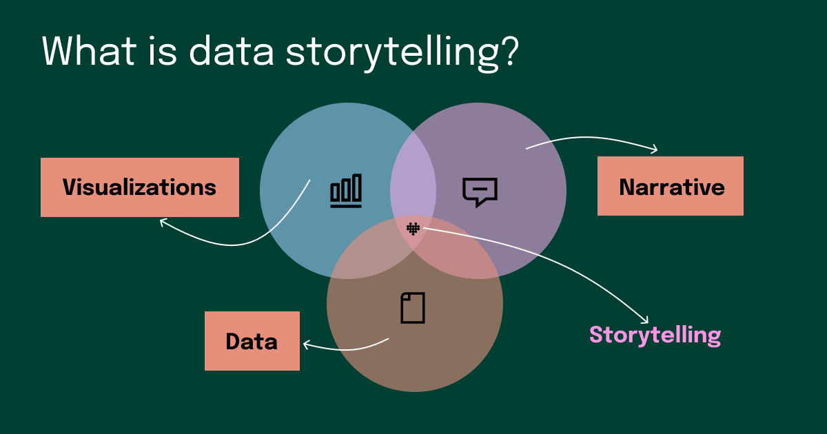
What is the relationship between data visualization and data storytelling?
While data visualization represents the graphical representation of information, data storytelling goes a step further. Think of visualizing data as creating an illustration in a children's book that helps illuminate the scene. In contrast, data storytelling is the narrative as a whole, using visualizations to enhance the story, trigger emotions, and drive the audience to take action. It's a more comprehensive approach that combines visual elements with a compelling narrative.
Data storytelling can be valuable for many different professionals. Whether you work in Business Intelligence, marketing, or data analytics, incorporating data stories in your presentations may help you successfully deliver your message, better convey valuable insights, and make an impact in your organization.
So how can this versatile approach be applied in practice? This question leads us to explore the practical applications of data storytelling.
Related reading: All about data visualization
What does data storytelling look like in real life?
Imagine, for a moment, that you’re a performance marketing manager or a data analyst who is looking to convince their chief marketing officer to endorse the subscription to an amazing data tool called Funnel (just go with us for a bit). You’re looking to automate your reporting processes and amp up your data analysis, and you’re sure this tool will help.
You could gather your operational data that shows your marketing team, collectively, spends 10 hours per week manually reporting on marketing data. You put that into a bar chart along other subject areas your team works on. Then, you make a big presentation to the CMO to argue that these 10 hours are a colossal waste of time, money, and resources that could be spent elsewhere.
Ok, but a CMO might say, “Ten hours a week? Across five people? So, that’s two hours per week per person. I don’t find that so bad.”
Tough break. But let’s try to approach that CMO with a bit more of a data storytelling mindset.
First, let’s approach with some broader business objectives. Your team may have been given a mandate to reach more people despite the same budget as last year. All told, you're spending 40 hours per month (an entire week) solely dedicated to manual reporting processes.
Then, make the argument for your solution. You could claim that, by implementing Funnel, you could shave 36 hours a month off that reporting time. That time would then be invested into other, more valuable initiatives, like optimizing ad spend and increasing the company’s marketing efficiency ratio. Improvements in those metrics could shine a more favorable light on the entire marketing team in the eyes of the board.
See what just happened?
That’s a tough argument for a CMO to object to. First, you’re connecting your team’s struggles to the broader business initiatives. You’re making the case that the manual reporting is holding you back from meeting those goals. Then, you bring it home with some key performance indicators that show leadership that you’re plugged in to the data that matters. You're truly presenting "actionable insights."
Plus, you linked the problem to a ready-made solution. Also, by looking at the hours spent in a monthly context rather than weekly one (40 is greater than 10), the problem naturally feels a bit more impactful.
That is the essence of telling data stories. You gather your data and add a narrative that speaks to a specific audience while moving them toward an intended action.
And don’t forget, an effective data story is not just about presenting numbers. It's about extracting key insights and valuable data insights that resonate with the audience. Visualizations will play a key part in your argument.
Effective Data Storytelling: A Guide
Effective data storytelling goes beyond mere visualization; it's about using data insights to tell a story that connects with the audience. Here are 3 tips to ensure your data stories effectively communicate insights and make a lasting impact.
Tips for telling a great data story
Data storytelling (much like regular story craft) is an art. However, there are a few tips you can follow to make sure you create the best tale, based on the best data possible.
1) Start with your audience
Movies are a great analogy here. You wouldn’t want to present a Disney plot to an audience interested in a movie like Scarface, and vice versa. You need to be sensitive to the needs, desires, pressures, and expectations of your audience.
In a marketing data context, think of who will be in the room and who you need to take action. Are they fellow analysts, or data scientists? Are they members of executive leadership? Are they from another part of the organization?
Who your audience is will have a direct impact on the kind of story you will create.
2) Be vivid and evocative
Let’s be honest. Data is bland. Complex data can be confusing. But it doesn’t have to be!
That’s where you, the storyteller, come in. Rather than saying, “our users love our product,” provide some colorful context to how much they love the product. You might have data that proves you have more than 1 million happy customers, 90% of whom are happy to recommend your product to a friend or family member.
Now that is some love.
Don’t get too carried away, though. While flourishes and some embellishments are good, your story still needs to be based in truth and data.
3) Bring in those visualizations
As we mentioned, visualizations are part of great data storytelling. But as we’ve covered before, choosing the right visualization for your data is equally important.
Remember that bar chart that showed the hours spent on monthly reporting next to your other activities? Imagine if those other activities far surpassed the time spent on reporting.
It would be like saying, “Look! See that tiny fraction of our time? It’s awful. We actually don’t spend much time on it, but we need a new tool to get rid of it as soon as possible.”
Not exactly the most compelling argument. Instead, you may want to show your reporting time against other, insignificant time spent on administrative tasks.
And as usual, avoid pie charts. Need some advice about data visualization tools? Read our blog on the 12 best.
A good data story is worth 1,000 pictures
We often make the case that a visualization (like a picture) is worth 1,000 words – or should that be 1,000 data points? But those visualizations aren’t worth it if they don’t serve a bigger, more compelling story.
Whether it’s movies, advertising, books, cave paintings, or data reporting, human beings are attracted to great stories. They help us make sense of the world around us and understand our place in the universe.
So, next time you need to dive into your data tools to find some insights to present to your clients, managers, or other stakeholders, don’t just give them a report. Deliver a data story.
Disclosure: the featured image for this post about data stories was created using generative AI.