
Data makes everything better. It’s like a magic elixir that makes your presentation incredibly nutritional, yet sugary sweet. But data isn’t the easiest thing to serve up to your guests, ahem, your audience.
Great data needs an equally great dashboard that highlights all of the juiciest insights in an eye-catching and intriguing way. What’s more, those dashboards need to be actionable. (That’s business-speak for “people need to gain value from it.”)
So, how do you pack these tasty dashboards full of data-licious value? We’ve got five quick and easy tips to make your dashboards unforgettable.
- Selecting the right visualizations
- Use placement and positioning wisely
- Color commands attention
- Size and scaling help tell your story
- Headlines sell your story
1. Selecting the right visualizations
Visualizations would be the plating if we cooked an unforgettable data-driven dish. They arrange data in elegant and enticing ways to draw in your audience. They are the first thing your audience will notice.
Good visualizations make your dashboard look more fabulous, and they can help identify patterns or correlations that would otherwise be difficult to spot. Try to identify seasonal trends by staring at a bunch of numbers in a spreadsheet instead of with a graph or chart. Yeah, no, thank you.
Your visualizations should help tell the story embedded within your data. To tell that story, you need to select the right type of visualization.
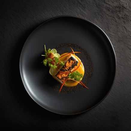
Let’s step back into our metaphorical Michelin-starred kitchen. The chef painstakingly selects plates and bowls to ensure that it beautifully frames the food in the eye of the customer and allows for easy eating. A white plate might present the food like a museum exhibition, while a black plate can make bold colors pop out.

Notice how the gold plate accentuates the gold tones of the pastry?
The same is true of your visualization selection. You wouldn’t try to show trends over time using a pie chart (and we don’t recommend using a pie chart for anything). Instead, you’ll probably opt for a time-oriented line graph.
Additionally, if you’re trying to highlight the growth in Google Ads performance versus your other paid channels, you may want to use a good old bar chart. It can quickly convey the comparison in an instant. And that instantaneous understanding is what we’re aiming for.
2. Use placement and positioning wisely
Once your visualization types have been selected, paying close attention to how and where the data is presented is essential. Let’s jump back into the kitchen.
The chef precisely arranges every piece of food onto the carefully selected plate. In our high-end kitchen, each plate aims to convey a story, thought, or emotion. The food can sometimes be architectural. And the chef wouldn’t put the garnish underneath the main food (unless it was somehow intentional).
In a dashboard context, the same is also true. The entire visualization should work in harmony and be easy on the eye. In our bar chart comparing Google Ads performance, it’s a good idea to arrange the bars in ascending order, with the highest bar for Google Ads all the way to the right.
Also, in our time-oriented line graph, time should run left to right. Flipping it around would be, well, backward. Your audience would be quite confused.
When building your dashboard, consider how your audience typically reads. A Western audience will start at the top-left, then read to the right and down. Not all cultures read this way, though!
3. Color commands attention
In the hands of an artist, color can be an incredibly powerful tool. In the wrong hands, though, it can turn your dashboard into a hot mess.
Let’s think back to our gourmet food presented on a black plate to make the color really pop. A great chef will limit the colors on that plate to about three — less if possible. This draws the eye in and focuses attention on a single experience.
*Note: image generated using AI*
You can achieve the same effect in your dashboard. You could gray out the bars for the other represented platforms in your Google Ads bar chart and leave the Google bar as one vibrant color. Your audience will be drawn straight to it.
However, use this secret superpower wisely. Your dashboard should have a focused color theme or a restricted palette. Perhaps all information is grayscale, and you use a single color for highlights and callouts.
If you start going wild with color splashes in multiple tones, your audience’s eye will be drawn all over the screen, creating confusion.
4. Size and scaling help tell your story
While it may seem simple (or even obvious), it’s crucial to consider how scaling different visualization elements can help tell your story. Larger dots and bars connote “more” in a graph.
Additionally, a larger visualization in your dashboard (compared to the others) will indicate that the largest is the most important.
Like all of our other tips, keep it simple. Don’t overdo your use of scaling. Too many size variations will confuse your audience.
5. Headlines sell your story
Let’s pop our heads back into the kitchen one last time. Every chef, from gourmet to fast food, relies on headlines to sell their creations every day. It’s all on their menu.
Some chefs go with straightforward headlines that describe their dishes like “fläsklägg” (that’s “pork leg” or ham hock in Swedish). Other chefs prefer more experiential names and headlines for their dishes.
No matter which direction you prefer, your headlines can contextualize the story of your visualizations.
Just like color, crafting compelling headlines is an art. Your headlines need to tell your story in only a couple of words — time to bring back our Google Ads bar chart.
Instead of calling a bar chart “conversions per channel,” you could give it a little finesse and call it “surprising performance from Google Ads.” Even in this made-up example, you probably can envision a specific scenario the marketer is experiencing just from that headline, right?
This made up marketer has probably seen even results from all of their channels until this month. Then, boom: an explosion of performance coming from Google Ads. That may lead the working group to consider how they leverage this new performance growth further, or explore why the other channels aren’t keeping up.
All that from one headline.
We do have one caveat, though. If you’re creating a regularly distributed report (say, weekly performance results), then a basic title like “conversions per channel” might be better suited. That way, everyone quickly recognizes what they’re looking at every week.
Read next: What is data storytelling, and how can it make your presentations magical.
Cooking up stunning dashboards
There are loads of different ways you can raise your dashboard game. But with these five quick tips, you’ll be well on your way to juicier data-licious reporting.
If you’d like to learn more, or if you’d like to discover other great hacks and techniques for your dashboards, check out our YouTube channel. We have loads of great videos to help you become a better data-driven marketer.
And be sure to “smash that subscribe button” while you’re there.