I was talking to a colleague the other day who told me about a conversation they just had with a customer. The customer had asked “Why can’t I create pie charts in Funnel?” and my colleague’s response, jokingly, was “Our product team really doesn’t like pie charts”. While it’s true most of us are no huge fans of pie charts, the reason we haven’t invested in supporting a pie charting option is because we believe they are rarely a good fit for the problem they’re intended to solve.
The pie chart (or pie graph) is one example of a visualization choice where I’d argue there's almost always an alternative that displays the data more clearly. This topic has been covered extensively by Stephen Few (among others) and if you’re interested in the topic I strongly recommend taking a closer look at his work.
This post will run through a couple of different common practices for visualizing data and show that there are better alternatives. To a large extent it draws on inspiration from Mr Few.
A better option to pie charts
Pie charts are typically used to tell a story about the parts-to-whole aspect of a set of data. That is, how big part A is in relation to part B, C, and so on. The problem with pie charts is that they force us to compare areas (or angles), which is pretty hard.
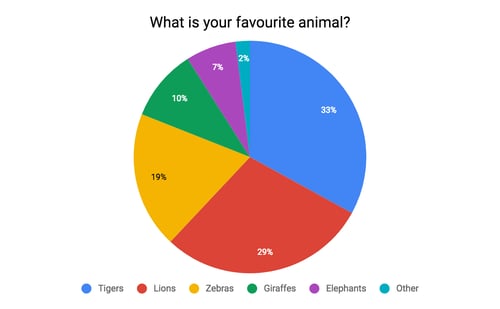
Are Tigers more popular than Lions? How much more popular are Zebras than Giraffes?
The problem with pie charts
Looking at the pie chart above, it’s not obvious how the different slices stack up in terms of size. You can, of course, find out by doing the math yourself, looking at the slices’ values. However, a chart meant to visualize size differences that forces you to do math to figure out size differences is not much better than a table, although it’s prettier.
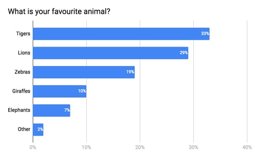
A better option for visualizing the parts-to-whole relations of a data set is the bar chart. This is because it lets us compare the different objects by their length, which is one dimensional. Comparing objects along one dimension is a lot easier than along two, which makes comparing the length of bars a lot easier than the areas of pie slices.
Tigers are more popular than Lions! Zebras are twice as popular as Giraffes!
The one thing pie charts do well is to tell the story that what you’re looking at makes up part of a whole, signified by all the slices adding up to a complete circle. That is probably about it, though. And yes, of course, they're pretty.
When is it not appropriate to use pie charts?
In short, it is not appropriate to use pie charts when you have more than 5 'pie slices'. Also, try to avoid using pie charts when you are not talking about percentages. If the pie chart shows something that adds up to 100%, you might use it. But it still is not your best option, as explained above.
Showing change over time? Line chart!
It’s tempting to use column charts when visualizing a time series. I’m guessing that’s often due to the same reason as our propensity to use pie charts: it’s quite pretty. Provided we’re prioritizing ease of interpretation over aesthetics, however, it’s not the best option.
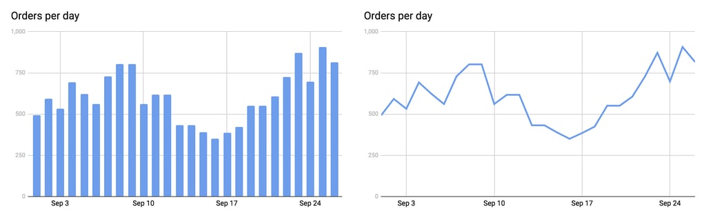 The two charts above are showing the exact same data. While the column chart isn’t as bad for time series as the pie chart is for comparing parts of a whole, the line chart is the better option as it provides more help to our eyes when we try to figure out how a value is developing over time.
The actual data really is just a collection of data points with time stamps to them; dots, if you will. The line chart helps us connect those dots, making a story emerge quite clearly. The column chart doesn’t really connect the dots and tends to have us focus on comparing individual columns, which is typically not the goal of showing a time series.
Now, while pie charts are rarely the right solution for any problem, that’s not true for column charts. They happen to be great at visualizing the relative difference between a few different items:
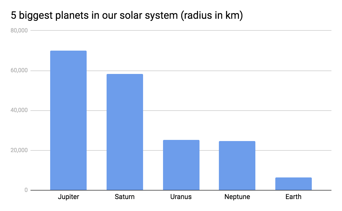
Source: https://www.universetoday.com/36649/planets-in-order-of-size/
Try using a ratio instead
Not as common as using pies for parts-to-whole or columns for time series, but still a usual suspect, is the double y-axis trap. Double y-axes cause problems as we’re tempted to compare things that don’t really allow comparison. As an example let’s take the metrics Orders and Marketing cost.
Say your orders keep increasing steadily and your marketing cost is somewhat stable. Depending on how you set the scale on the two axes, your chart will tell very different stories:
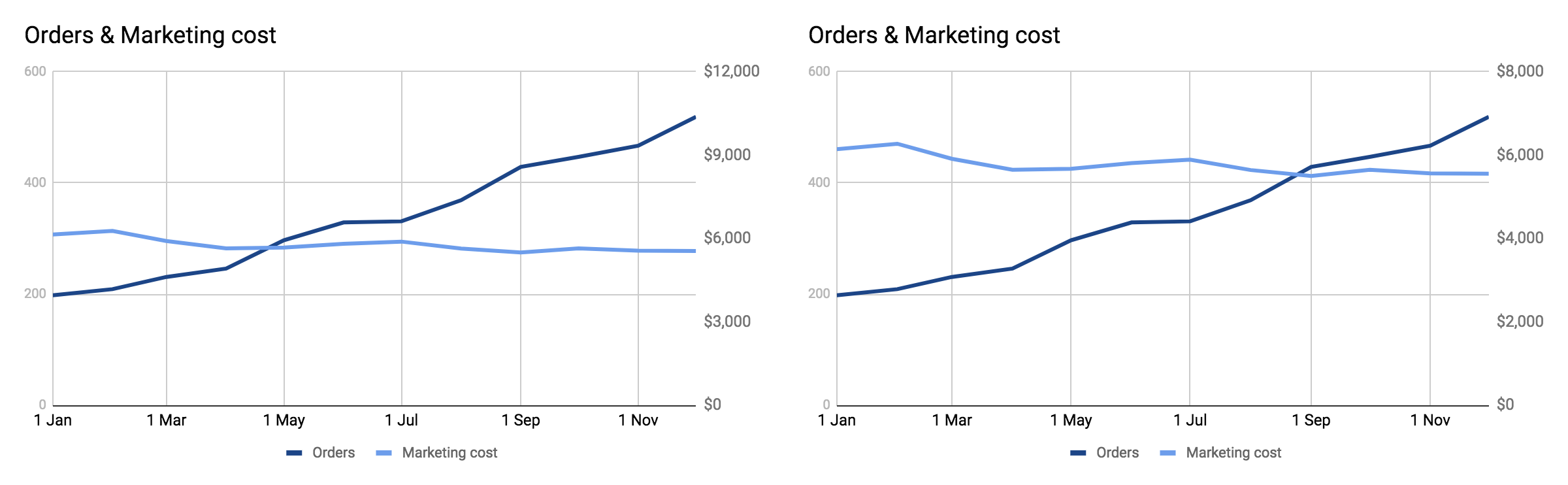 What’s going on at the intersection of the two lines? Oh, nothing. It was just a function of the scales of the y-axes.
The two charts above are showing exactly the same data but with different scales for the Marketing cost axis (the right axis). When there are two intersecting lines in a chart we tend to be drawn to the part of the chart where the lines cross each other. That is, in April for the left chart and in August for the right one. However, where the intersection happens is completely arbitrary and depends entirely on how I set the scales.
If we’re interested in the relation of these two metrics, plotting the ratio between the two is a better option:
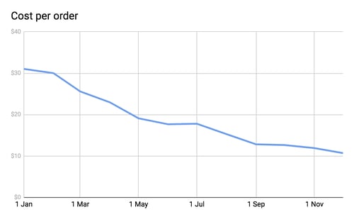
Aha, the cost per order is continuously declining!
Although these examples are by no means all the mistakes that are easy to make when visualizing data, they are some of the most common. If you think I’ve missed something, or if you don’t agree please let me know in the comments!
PS. You can read more about bad visualization habits in our recent blogpost: What are Misleading Visualizations and how to avoid using them.