
Data visualization is an essential tool for any modern marketer. After all, what good are all of your performance metrics if you can’t see what’s happening?
Creating great data visualizations can help you to discover which of your marketing channels are contributing most to your overall performance, and identify patterns and trends. Visual data can help you to see how advertising on different platforms may be affecting each other. They can help you to communicate how your team is helping to grow the business.
Basically, data visualizations are the lifeblood of savvy marketers.
What is data visualization?
At its core, data visualization is the process of making raw data and information visible and understandable for people. It is a visual way of presenting data, and communicating patterns and trends. This can be as simple as plotting a bar chart in your regular spreadsheet tool, or it can be as complex as a dynamic infographic. Data visualization helps deliver a message, rather than just sharing the data without any clear messaging.
It also helps you better identify patterns in your data. Is there a trend you've been missing by just looking at it in a table? Is there an anomaly in the data set?
Why is data visualization important?
The value of data visualization is that it enables people to perceive, engage with, and understand data more easily. The right visualization can bring everyone to the same level of understanding, regardless of their level of expertise.
When presenting marketing data and key performance indicators (KPIs), either to colleagues, your boss or a client, data visualization also plays an important role. Better and more clear visualizations will help you to tell your story in an impactful way.
We don’t need to know a lot about psychology to understand why visual analytics pack a better punch than just sharing numerical values. Our brains are naturally attracted to colors and shapes, and the cognitive load is less when analyzing shapes than digits. The benefits of data visualization are easy to sell in, the friction only starts when choosing data visualization tools and working out the best way to present data.
Unstructured data vs visualized data
Raw or unstructured data is sort of like an Excel spreadsheet with lots of rows and columns. Each cell contains a data point. The data is there, but it doesn't really tell a story. Normally, to make sense of any of this data, you need a graph or chart of some kind.
Take a minute to think of your favorite chart or way of visualizing data. Is it a pie chart? Perfect. Read this article from our chief product officer, and then pick a better idea.
We aren’t anti-pie here at Funnel, we just think that when your pie is a chart, it isn’t telling the whole story.
That graph or chart that you're thinking of, is a perfect example of a data visualization. It expresses the underlying data in a visual format. From that graph, you might be able to infer increasing performance or different trends. Without the graph, these same sorts of analyses would be much harder to determine.
But graphs and charts, alone, aren’t a panacea for all of your analysis needs. In fact, they can sometimes be misleading.
Misleading data visualizations
As we’ve covered before, visualizations can be misleading. Skewed scales or biased data can wreak havoc on your analysis.
Let’s pull one example out of that article as a refresher. The two graphs below show the same exact data: website sessions during a 2 month period.
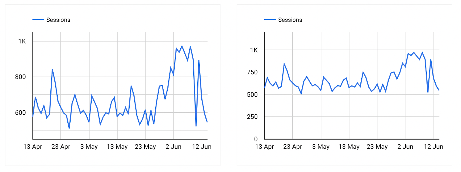
In the graph on the left, it looks as though there was a large spike in traffic around June 3. However, we only assume this is a huge increase due to how closely we’ve zoom the scales into the actual data values.
The graph on the right shows the same exact increase in traffic, but since it is zoomed farther out, it doesn’t seem quite so dramatic.
Now, imagine that you have to present this data to your CMO. It’s important that you use a data visualization that accurately reflects the situation, so that your stakeholders can make well-informed decisions.
In fact, using data visualization best practices should always be top of mind for digital marketers. Why? We’re glad you asked…
3 reasons to focus on good data visualization
- It makes data analysis easier
- Images strongly convey messages
- Data visualization is a good skill to have as a marketer
Effective data visualization makes data analysis easier
We know we give pie charts a hard time, but that’s only because there are so many other options to choose from. From Gannt charts, to chord graphs, to sunbursts, and more — different charts and visual representations of data make it easier to perform different kinds of analysis.
If you want to review performance over time, line and bar charts are a great way to do it. Scatterplots can help you determine correlation.
The right data visualization tool can help you find the perfect insight to help you unlock a new level of growth and performance.
Images strongly convey messages
You know that saying about pictures being worth lots of words? The same sentiment holds true for marketers. While the data may exist in siloed databases from loads of different platforms, pulling it all together into one graphic representation can help it shine.
Let’s think, again, about presenting our performance numbers to our CMO. If we start reciting the actual numbers of sales each month, the presentation is going to get awful dry awful quick. Plus, once you get past the third number, all of the data you deliver will likely go in one ear and out the other.
People, even CMOs, can be quickly overwhelmed when presented with a lot of numbers. Instead, an image that shows how you’ve performed is much more memorable. They convey the story of the data incredibly quickly.
Data visualization is a good skill to have as a marketer
Being a data visualization wizard can serve you for your entire career – and you don't need to be a data scientist to benefit. If you’re just starting out as an analyst, good graphs (and knowing which graphs to use) can help you begin to wrap your head around what is or isn’t performing.
As you grow in your career, having good visualization skills can help you prove to leadership that your strategies and efforts are having an effect on the business. Our advice for marketers is to learn at least one data visualization tool, for instance Tableau, Looker Studio or maybe Funnel's own Dashboards.
Even in leadership, good visualization skills can help you with presenting data in a meaningful way. You can use visualizations for marketing data, but also for other types of data. For instance finance or HR related.
Who needs to learn data visualization?
It should be pretty obvious by now that everyone could stand to learn some data visualization skills. However, that can mean different things to different people.
For instance, a data scientist will have a much more detailed and technical approach to the subject than a marketer. That data scientist may want to explore margins of error or perform complex statistical analysis. A marketer’s needs are likely not nearly as in-depth.
Even if you’re in a junior role, you may still need to present data in a meeting or online setting. You will still want to learn some data visualization techniques in order to communicate the findings properly.
Different data visualization methods
When approaching your visualization, it’s important to understand why your graphic will be used. Is it going into a dashboard for review by leadership or a client? Do you need to create visualizations merely to make sense of the data yourself?
With a clear purpose in mind, you can begin to build the right style of visualization.
For instance, we were curious about some of the finer details in the first 25 episodes of our Funnel Tips series. We were sure that Alex had some sort of “tell” or funny quirk that would manifest in every episode, but we weren’t sure what it could be.
To figure it out, we analyzed every episode until we had a set of manually collected data points. Some of the details that were discovered were pretty quirky. Case in point: Alex says “so” 5.23 times per episode (on average). We were having some fun, and wanted to compile all of the data into a single, easily understood piece that we could share with our larger team.
Our solution was to create an infographic, which you can see below.
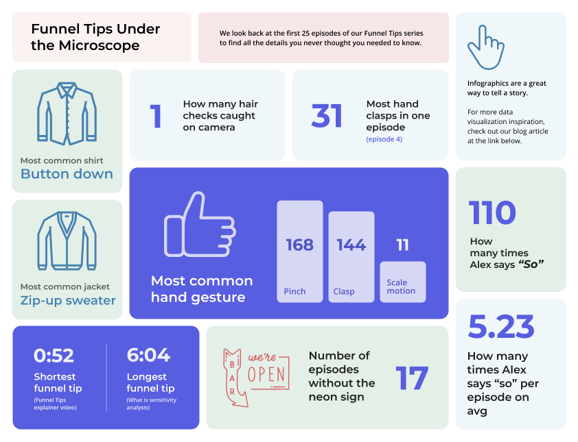
We knew that the type of data visualization (the infographic in this case) was going to have a diverse array of “data,” and an infographic is a fun way to present that type of information.
An infographic isn’t the solution for every situation though. You may need simple, clean graphics that can be easily embedded into a dashboard that is regularly updated. There are many types of data visualizations to choose from, so have some fun with it!
While we’re on the subject of dashboards, check out some of our Funnel Tips on the subject:
Data visualization tools
Let’s say that you know what your graphs will be used for, your data is collected and cleaned, and you think you’re ready to create incredible visualizations. Where do you go?
You’ll need some kind of data visualization tool. As with many things we cover on this blog, these tools can range from simple and free to complex and costly. It all depends on your specific needs. Data visualization tools provide everything from a basic bar chart to more complex ways of presenting data like a heat map or cluster graph.
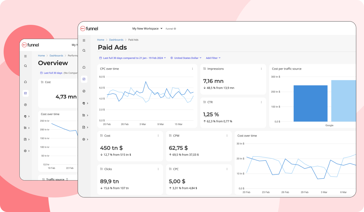
If you’re looking to test out how data visualization could help your monthly reporting and insights, try our Funnel Dashboards. It’s easy to use and available for everyone – even in free accounts.
If you’re a larger organization that needs to integrate marketing data with a robust business intelligence department, you may want to opt for something like Tableau or a more advanced data visualization tool.
Are you having trouble deciding? No problem. We’ve compared the 12 best data visualization tools for marketing agencies on the blog here.
Making data beautiful
The great thing about data visualization is that it can turn your analysis from monotonous to extraordinary. It can help you to quickly identify key areas of performance or areas that you need to improve.
Great visualizations have the power to tell a compelling story that will stick in the mind of your audience — which is why data visualization is important. It makes data human.