
Faced with a sea of data, professionals must work smart to separate the signal from the noise. Data visualization tools are key in this effort, but with so many options, how do you choose the best one for your needs?
Worry not — we've done the heavy lifting for you! This blog post presents 12 top data visualization tools, each catering to various levels of data maturity across organizations:
-
Funnel
-
DashThis
-
Klipfolio
-
Zoho Analytics
-
Qlikview
-
Whatagraph
-
Google Sheets
-
Looker Studio
-
Looker
-
Tableau
-
Microsoft Power BI
-
Canva
Before we explore these tools, let's first understand what data visualization tools are and why they're crucial for today's data-driven professionals.
What is data visualization?
At its core, data visualization is the act of turning raw data into some form of graphic representation. This could be as simple as turning the data from a Microsoft Excel spreadsheet into a bar chart or as advanced as sending data from multiple advertising platforms into a comprehensive interactive dashboard.
What are data visualization tools?
Data visualization tools are applications that allow users to create visual representations of data to simplify analysis and communication. They range from basic tools for creating straightforward charts to sophisticated software for developing dynamic interactive dashboards. These tools are essential for translating complex datasets into easily understandable visuals, enabling quicker decision-making and insight sharing via visual data analytics.
Why is data visualization important?
Data visualization is crucial because it transforms data into accessible insights that can be quickly grasped by a wide audience. It highlights trends, patterns, and anomalies, making it easier for teams to identify opportunities and challenges within their data. Visualization promotes a data-driven approach to decision-making, ensuring that strategies and actions are grounded in factual evidence rather than intuition.
Learn more: All about data visualization
Now, with that understanding in place, let's get into the list of top tools.
12 data visualization tool suggestions for marketing agencies:
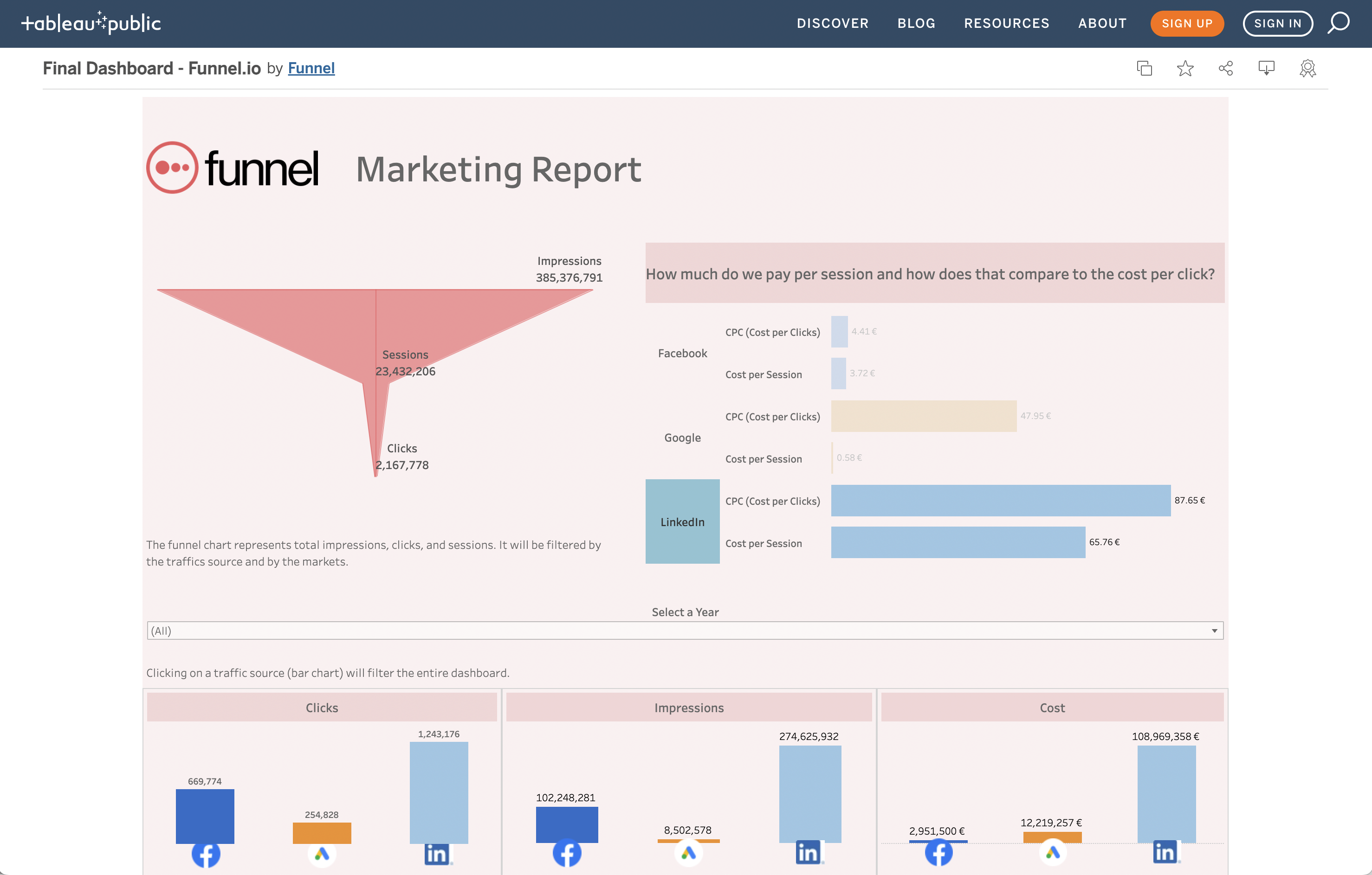
1. Funnel
Funnel is a marketing data hub that allows you to connect to data from just about anywhere and store, organize, and share it with ease. And, you can create data visualizations is simple with Funnel. You can use raw data as the ingredients for juicy insights that drive business growth.
.png?width=717&height=496&name=Automatically%20normalise%20data%20(1).png)
Funnel's new Dashboards feature provides even deeper insights, plus a range of advantages, including:
Speed and stability
Many data visualization solutions take so long to collate and integrate data that you may as well write it out yourself with pen and paper. Okay, maybe that's a slight exaggeration, but any delay in data retrieval means waiting longer for business-critical insights.
Another challenge is that data tools are only as stable as their data sources. In other words, if a data source glitches or goes offline, the entire data pipeline can collapse. That doesn't happen with Funnel. This platform retains stability and speed regardless of what occurs at the data source end. Working with data becomes simple and more enjoyable, plus you get better, faster insights from your data analytics and visuals to optimize your marketing performance.
Frictionless data exploration
Data visualization dashboards can be very pretty. However, many are entirely static, only showing the surface insights of the data in front of you. Funnel allows you to drill down into any data to find out more — a feature unmatched by most competitors. This makes it super easy to answer the question "why" whenever you or a colleague find something interesting in a chart on a dashboard.
End-to-end solution
If you have to manually enter complex data from databases or spreadsheets to get detailed insights, your data pipelines are not working hard enough for you. Likewise, if your dashboard highlights gorgeous visualizations with no context or explanation, you end up doing all the heavy lifting yourself. Funnel includes all the connectors you will ever need together with your dashboard. You don't need to pay for, set up, or figure out any other tools to get your dashboard up and running.
Automatic normalization of marketing data
Funnel is built for marketers and knows exactly what to do with your data. Forget hours of manually creating formulas that fall over if you move a data point to the wrong place. Funnel takes care of the mapping of data from different data sources and also converts currencies, metrics, and numerous formatting tasks to avoid conflicts and ensure data is clean and usable. You don't need to be an Excel wiz or data engineer to get a dashboard you can trust. But rest assured, if you're a data management expert, you'll love Funnel too!
Get started with Funnel
It’s simple to get started with Funnel. Connect a few marketing platforms — like TikTok Ads, Facebook Ads and Google Ads — and instantly bring all your campaign data into a single, ready-to-analyze dashboard. If you'd like to see what's possible, book a demo and we'll walk you through it.
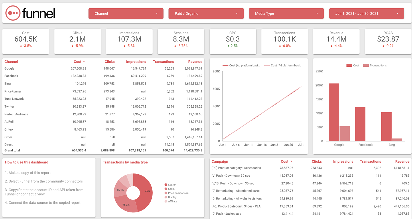
2. Dashthis
The DashThis website bills its platform as "Marketing reporting made easy." When you consider that marketers have to deal with increasing numbers of data sources every day, that's a big claim. However, reviews indicate that DashThis is easy to use and allows marketers to set up dashboards in less than ten minutes.
The platform connects to all the usual suspects: Google Ads, LinkedIn, Facebook, etc. It's packed with automated features and allows external clients or stakeholders access to dashboards.

Image source: DashThis homepage.
DashThis offers a free trial. The price after the free trial is a minimum of $42 a month, increasing with the size of your organization. The different price points determine how many dashboards you can have, although all offer unlimited data source integrations. Higher price points allow users access to a white label dashboard — that means no DashThis branding — ideal for data managers supplying insights for multiple clients.
3. Klipfolio
With praise in publications like Forbes, Klipfolio is building a name for itself as a great option for importing, editing, and analyzing data for marketing success. The platform is entirely no-code, meaning users just click and point at the integrations they need and then select the datasets that matter to them.
This may leave users who want a bit more of a bespoke dashboard feeling cold. One downside reported is that if you want insights outside of the pre-defined templates, this is difficult to arrange. Drilling down into the data available on the dashboards is also an ongoing challenge.
Overall, Klipfolio is user-friendly, accessible to marketers without any data management experience, and offers excellent customer support.
4. Zoho Analytics
Zoho Analytics is part of a growing suite of tools, including bookkeeping for small businesses, that's essentially a rival to QuickBooks. Zoho also offers a CRM and app creation services; however, we're only diving into the analytics today.
This is a combined business intelligence (BI) and data visualization platform. In addition to providing sleek, professional charts, graphs, and even sales maps, the platform quickly provides key insights to help hone marketing efforts.
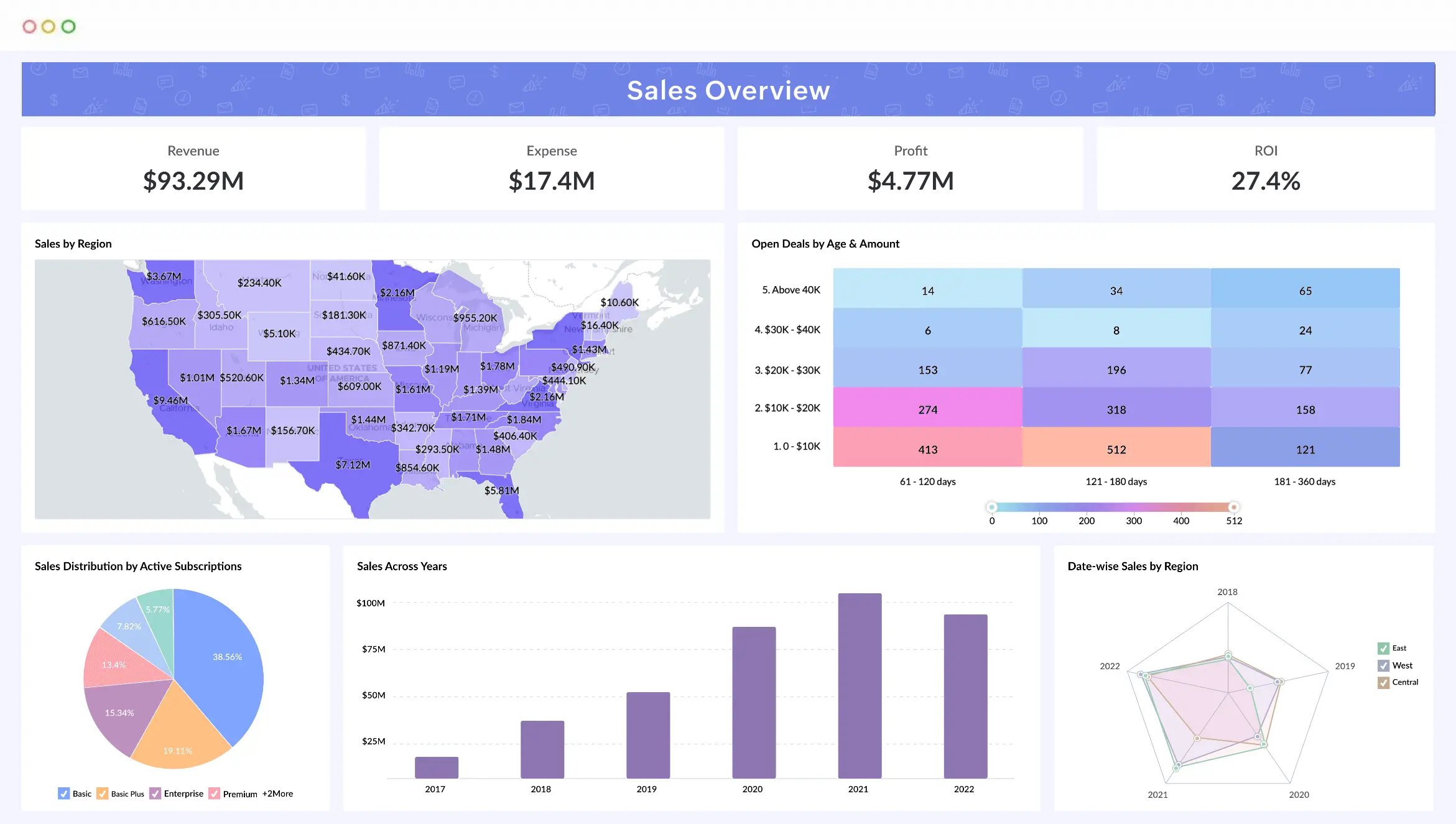
Image source: Zoho Analytics home page
Patrick Moorhead of Forbes noted, "The platform represents an intriguing offering from an intriguing player in the enterprise SaaS and BI market" and praised the platform for improving data consistency and promoting simplicity.
You might also like: 9 tips to improve client reporting
5. Qlik Sense
Qlik Sense is the descendant of QlikView, which the company described as a "first-generation BI solution." QlikView provided agile data exploration for over 20 years, but now there's a new sheriff in town. Qlik Sense offers full self-service analytics and data visualization solutions, focusing on simple, fast data extraction and loading plus "data storytelling" for better insights.
Qlik Sense is handy for fast-growing businesses with marketing campaigns that expand into multiple audiences. There's a high level of customization available. However, it can be an expensive option for smaller companies.
6. Whatagraph
Whatagraph is an all-in-one marketing data solution aimed at teams and agencies. Like many of the cross-channel marketing analytics solutions on our list, it's promoted as a way to ditch the tech stack full of separate tools and opt for a single solution.
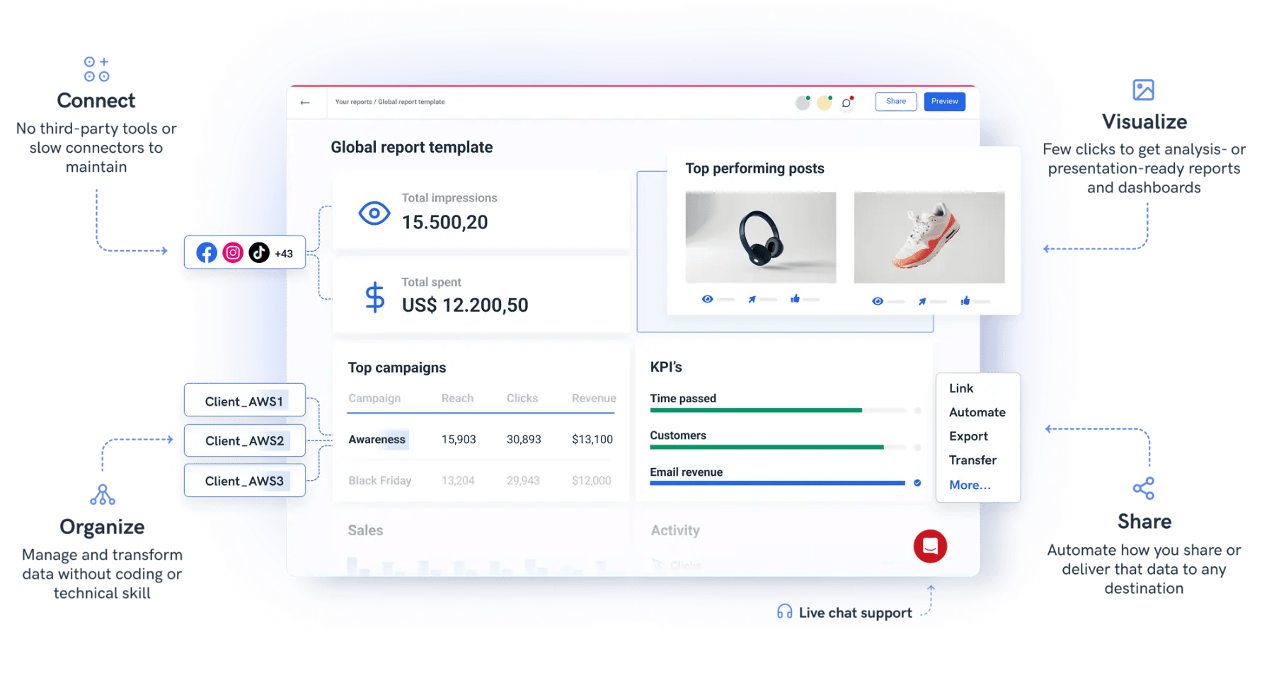
Image source: Whatagraph homepage
The platform provides clean, uncluttered visuals with clear context. These would best suit marketers with low data management experience who need quick, surface-level insights. The easy-to-navigate interface and quick setup options make this an excellent entry-level marketing data visualization solution.
7. Google Sheets
This is one of the easiest tools to use: Google Sheets. Part of the broader suite of products from Google, Google Sheets is an easy-to-use spreadsheet program. In fact, it is used by many of our customers to analyze data and share insights.
While some use it as a makeshift data warehouse or staging area, it can also be used to create simple graphs like pie charts, bar charts and more. These visualizations can then be exported to other products, or housed within Google Sheets, in order to create a basic data dashboard.
 An example of simple visualizations you can make with Google Sheets
Although it doesn’t offer some of the more robust functions and features of other top visualization tools on this list, it stands out for its low barriers to entry, stability, cross-collaboration, and the fact that it is free to use. It’s the perfect entry point for those who are new to data marketing, data analytics, or data visualization.
8. Looker Studio
Staying within the Google cloud universe, Looker Studio is another great visualization tool for data marketers. It even allows you to add multiple data sources, such as advertising platforms, Google Analytics and Google Search Console.
While Google Sheets is typically used to create and manage spreadsheets, Looker Studio is designed specifically to create interactive dashboards that can help to identify trends and insights. Much like other products in the Google marketing and analytics package, this tool is incredibly easy to use and features great cross-collaboration functions.
 Screenshot taken from one of our Google Data Studio templates
Looker Studio is a great way to wade a little bit deeper into the pool of our data visualization software since it gives you all the basics, does not require any SQL coding, and it is free to use. Plus, with automated updates and notifications, it can be a powerful tool for everyone in the marketing team.
“We can push data to Looker Studio, where we can build the most awesome reports,” said Dylan van Der Heir, marketing manager at Zonnebrillen. “It's being sent daily at about seven o'clock in the morning. You stand up and see your sales from yesterday and have your insights in your mailbox - that's very cool!”
9. Looker
Acquired in 2019, Looker represents the apex of the Google visualization options. If Looker Studio is great for creating free dashboards and reports, then Looker is the tool to draw business intelligence out of the data.
In fact, Looker’s robust functionality makes it a great choice for marketers working with “big data” or alongside BI teams. As a paid service, it can offer predictive analytics and modeling to marketers who are comfortable digging deeply into their data.
If you’re fairly well-versed in handling marketing data from multiple sources, and you’re seeking some more advanced reporting, Looker could be one of the best data visualization tools for your team.
10. Tableau
One of the most popular BI and data visualization tools, Tableau is a major platform that can be used for a wide array of applications. In fact, it can be used for simple data visualizations, robust dashboards, interactive charts, predictive modeling, and more.
Available as both a cloud-based solution or locally installed within an organization’s protected network, Tableau is incredibly flexible and robust. It excels at handling and processing vast amounts of complex data at speed.
 A Tableau dashboard
While it can cater to marketers at any level of data sophistication, it is probably best suited for large organizations that are seeking a top data visualization tool for multiple departments, including business intelligence teams. This is due to the sheer scale of its power as well as its cost — carrying one of the higher price tags on this list.
In any case, though, once you dig into the more powerful functions, it’s easy to see why Tableau is one the most popular data visualization tools available today.
11. Microsoft Power BI
Are you looking for one of the top data visualization tools? Check. Do you need a solution with world-class support? Double check. Does your organization run a Microsoft tech stack? Triple check.
Microsoft Power BI, part of their Azure marketplace, is an incredibly robust business intelligence platform that can help you draw insights from all sorts of data. It’s used by some of the largest organizations in the world. Plus, it can cater to all types of data marketers (from beginner to experts).
Although it shines when processing lower volumes of data than Tableau, its rock solid integrations with other products in the ecosystem make it the perfect choice for organizations running on a Microsoft technology stack.
12. Canva
"Hang on a minute," we hear you cry. "Canva's just a design tool!" Well, remove the "just" from that sentence, and you're almost there. Canva is an excellent design tool and offers multiple templates, including graphs, charts, and data storytelling. In fact, Canva now has an entire section dedicated to marketing, with some features available in the free version.
Canva integrates with multiple business tools, including Slack, Sharepoint, and Google Drive, making data visualizations instantly shareable. What's more challenging here is to create an entire dashboard. Canva can help you make your data look stunning, but you still need the skills or tools to draw critical marketing insights from it. Ultimately, it's not a business intelligence tool, but it's ideal for marketers who want to create data visualizations with clarity and cohesive branding.
And so much more
These selections represent just a handful of our top visualization tools, but there are loads more to choose from. For instance, IBM Cognos Analytics is a powerful BI solution that makes it incredibly easy to create and share interactive reports.
Additionally, SAP Analytics Cloud offers a variety of tools and features for marketers looking to create dynamic visualizations that can be shared across an entire organization.
Do you like this content? You might also want to read our top list of data transformation tools for marketing.
Data visualization capabilities
The capabilities of data visualization tools are vast and varied, playing a critical role in how effectively organizations can interpret and leverage their data. Here's a closer look at three key capabilities:
1. Automatically getting the right data
One of the foundational capabilities of any data visualization tool is the ability to seamlessly integrate and manage data from various sources. This process can vary significantly between tools.
For instance, while Google Sheets is a popular option for its accessibility and ease of use, it may require additional steps or software to import data automatically from multiple sources.
On the other hand, platforms like Funnel stand out by offering over 200 connectors that automatically pull data from different platforms into the product. This capability not only saves time but also ensures that users have access to the most relevant and up-to-date information for their visualizations.
2. Creating different chart types
The ability to create a wide array of chart types is another crucial capability. Data visualization tools typically support a variety of charts, such as bar charts, pie charts, and time series charts. Each chart type serves a specific purpose and can help in representing data in the most appropriate and insightful way.
Bar charts are excellent for comparing quantities of different categories, pie charts show the proportion of parts to a whole, and time series charts are ideal for illustrating changes over time. However, it's important to note that while having a broad selection of chart types is beneficial, it can sometimes be overwhelming for users who are new to data visualization.
Looker Studio, for example, offers an extensive range of options that, while powerful, may require a steeper learning curve to navigate effectively.
3. Collaboration and Sharing
Collaboration features are essential for teamwork, allowing multiple users to work on the same visualization. Sharing capabilities ensure that insights can be easily distributed to stakeholders. This fosters a transparent, data-informed culture within organizations, making collaboration and sharing pivotal for effective data visualization practices.
Choosing the right tool for you
When determining your favorite data visualization tool, it’s important to keep in mind your own needs as well as your organization’s technical capabilities. As we mentioned above, Power BI is great for those running on Microsoft across the organization. However, it may not be the best solution for those who utilize the Google Cloud Platform.
Plus, if you're just starting to dip your toes into the data marketing pool, you may not want to jump head first into an advanced and robust tool like Tableau. Be sure to take stock of what you really need, and decide for yourself what the top visualization tools for your organization is. Some questions to ask yourself or your team:
- Do we need to add a lot of data sources, or just some? And is it easy to import data?
- How scalable is the solution we are looking at?
- Do we want interactive visualizations, or just static ones?
Answering the above questions will help you choose the best data visualization tool for you. And, to learn more about how these various tools can work for you, and to see some other available options, check out our data destinations.
Try this next: This year's top client reporting tools