
In this blogpost, we hope to give you some inspiration for your next visualization project.
For many marketers who are digging into the best approaches to data visualization, we tend to recommend three different ideas for consideration:
- Using color and movement
- Using less common graphs when they match your data
- Exploring custom infographics
Each of these pathways require increasing levels of artistry, but they also offer increasingly innovative data visualizations that can tell your story faster and more effectively.
Make it eye candy
One of the easiest data visualization ideas to get started with is infusing your graphics with interesting color and movement. For those of us who use typical data visualization tools, our graphics tend to be “50 shades of blue.” There’s nothing wrong with that necessarily, but it's also not going to make your dashboard stand out from the crowd. Perhaps some purple can be included as a highlight color? Maybe you could use some orange for contrast?
Color can be a powerful tool to draw in a reader’s eye. However, as we’ve mentioned before, you want to be smart about how you use bold colors in your data visualizations. They should be used for accents and attention grabbers. Also, it’s a good idea to keep your color palette a bit limited. Otherwise, you run the risk of your dashboard looking like a bag of Skittles.
Don’t limit your use of color to just the bar chart and line chart options, either. While many out-of-the-box dashboards will use white or light gray as the standard background, it may be worth considering black or darker shades for your background.
Think about this: most museums use white walls in order to create a clean environment around each piece of artwork. This can help a visitor focus on a preserved piece of art in a sterile and serene environment, free of distraction. On a dashboard with multiple data visualizations, though, it’s a bit harder to create that isolated feeling where a viewer can focus on a single piece of data art.
By contrast, many modern creative agencies use black backgrounds when presenting client work on their websites. This is because the black helps the colors in the artwork pop off the screen. This helps the art feel bold, vibrant, and impactful. This could possibly be a good choice for your dashboard depending on the audience, data story, and application.
So, at this point, we have a few data visualization ideas to tastefully infuse our graphics with color. But what if we could make it move?
While this may require a little bit more technical knowhow, movement can make a huge impact. On the easier side, some data visualization tools and platforms allow you to create moving graphics for your dashboard. While they aren’t too complex, the subtle movement that they do create can help deliver the “wow factor” or help bring your data story forward.
On the more complex end of the movement spectrum is this. While the subject matter is a bit dark, it’s hard to argue that this creative data visualization itself isn’t beautiful art. This likely required the help of a web developer to produce, but as we move up the complexity ladder, it’s a nice data visualization idea. (Keep reading – there are more creative and interactive data visualization ideas further down!)
Find a hidden gem
Let’s take a moment to bring the complexity level down slightly and talk about which graphs or chart types we should actually be using.
As data-driven marketers, we know that not every chart or visualization is interchangeable. For example, some graphics are good at telling a comparison story, some are great at showing data over time (time series data), and others are great at showing distribution. However, that doesn’t mean that every comparison graph needs to be a line chart or pie chart. In fact, there are many options available.
By selecting relevant but lesser used graphs, you can bring that little touch of difference to your dashboard to help it stand out. Need some more specific data visualization ideas?
Ditch the pie for a donut. Use a radar chart to tell the story of attribution or contribution. Even a Nightingale Rose diagram can bring a little extra flare to a normal stacked column chart. In each of these examples, the magic happens when you take a typical data visualization, and give it a little twist to make it unexpected.
As with color usage, it’s important not to take things too far. Your audience still needs to understand what they are looking at and grasp the insights — quickly. Plus, if your data doesn’t quite fit the graphic you're aiming to use, the results could be rather confusing for a reader.
What if color, movement, and visualization choice isn’t taking your graphics to the level you need? Well, we have another data visualization idea for you.
Next stop: designer land
As we hinted at earlier, we were going to start off with some simple steps to improve your graphics and slowly increase the complexity and artistry factor. We are now, pretty much, at the top of that mountain. Here, you will probably want to enlist the help of a graphic designer, because we are going to unpack infographics.
What is an infographic? Well, it’s exactly what you might expect. It is a graphic interpretation of data or information. They encompass everything from a subway map to brightly colored PDFs that deliver a number of statistics in one visual theme.
They can be extremely creative and a great way to deliver a lot of data in one visually interesting package. And they can take nearly any form.
The trick to creating them is to, first, collect a good amount of compelling data. Then, identify a story you believe those data points tell. With that, you can either brief a graphic designer on what you are trying to create, or even try an online infographic-making software.
The concept seems to be pretty popular, too. In 2021, infographics were the fifth most popular form of B2B content marketing in North America and the fourth most commonly produced content marketing worldwide in 2020, according to Statista. The message is clear, despite the design capability required to pull them off, infographics can be a great data visualization idea.


How do you visualize data creatively?
Innovative data visualization can come in many forms. Color is an easy and quick way to bring interest and focus to your graphics. Movement can make your visualization incredibly dynamic and impactful. We also know that choosing the right kind of graph can make a huge difference in effectively telling your data’s story. And, when you’re ready to take a step up, infographics provide a nearly unlimited amount of creative possibility.
Don't stop there
So you've graduated from basic data visualization to fancy infographics and added color and interesting takes on graphs to help contribute to wider exploratory data analysis – what next? The next step for your creative data visualization journey is interactive and animated visuals.
If you really want to make an impact (and have the resources to build something beautiful), giving your infographics a bit of motion can greatly increase your storytelling capabilities. In 2018 for instance, the Washington Post followed female politicians seeking office in the United States. The project generated a huge amount of data, which was later assembled into a dynamic web-based experience. You can find the project here and see more of their work on their Twitter.
Inspiring data visualization from around the web
Sometimes it helps to draw inspiration from outside of the marketing data pond, so we found four innovative examples of how visualization helps share data.
Information is Beautiful report on Vitamin D (link)

It's easy to understand why taking a vitamin D supplement might be beneficial for people living in certain countries after looking at the report on vitamin D by Information is Beautiful. They use color, maps, charts and other inventive ways to display data to make what could be a very dry informational piece into an engaging, inspiring article.
WeTransfer Ideas Report (link)

Elegantly designed and charmingly animated, WeTransfer’s 2022 Ideas Report shares insightful findings from their research on working within creative industries. The report itself can be downloaded in PDF format, but the research can also be explored in their responsive minisite too. Using graphs to display data is one thing, but exploring how statements, stats and research can be presented in a way that represents the community it came from, while also using interactive visualization to help the data land with greater impact – that’s quite another.
The Plotline (link)

Set up by Earth Genome – a team of data scientists, designers and creative technologists – The Plotline is an exploratory experiment in food science data. Food production and climate data science can feel vague and intangible, but with interactive visualization, games, and impactful graphic scrollytelling The Plotline brings it to life. The visualizations handle serious, sometimes shocking concepts, but the team managed to catch a tasteful balance of playfulness and sensitivity. A masterclass in how to visualize data.
Population Density in Europe (link)
.png?width=1600&height=912&name=europe_1km_density_exports_2%20(1).png)
As an alternative to doomscrolling his way through 2020, Alisdair Rae used data from the EU's Global Human Settlement project together with QGIS to create textured 3D maps, with spikes representing higher populations. As an alternative to heatmaps, Rae’s texture map finds a way to display data for an abstract concept like population more physical and real.
Bats and the Origins of Outbreaks (link)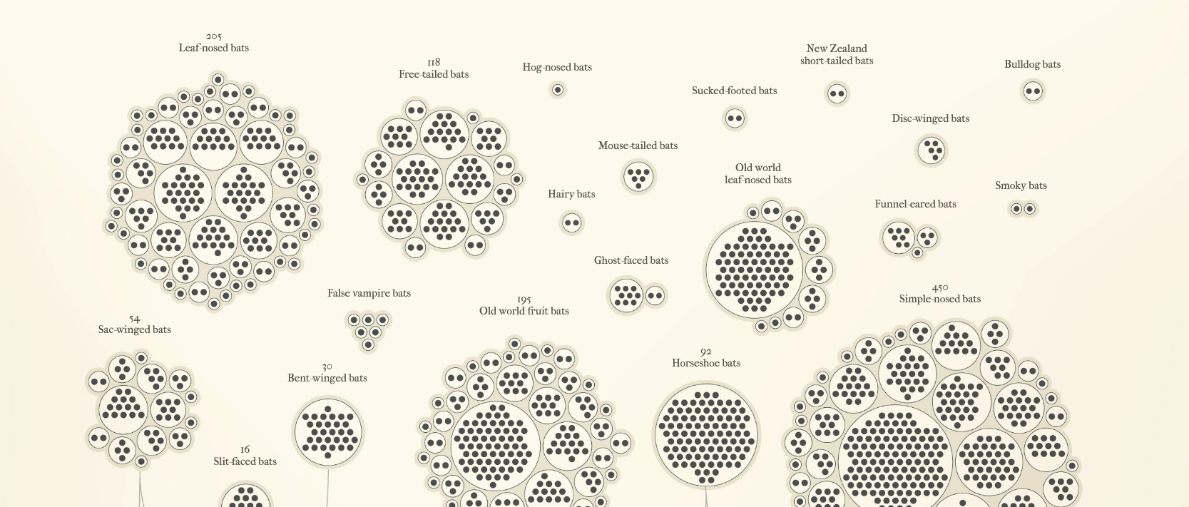
Who knew reports on tracing zoonotic diseases could be so beautiful? What could be a clinical and dry document has been transformed with elegant, creative data visualizations and hand-drawn illustrations. Leaning into the vampiric cliché, the page is given a nostalgic storybook touch without becoming corny. A practical insight into why bats make excellent hosts for disease, but also why they’re important for pollination and pest control, and need conservation.
Ready to step up your data visualization projects? Have a look at our Google Data Studio templates that you can download and use for free, and don't forget that you can use our data visualization tool in Funnel – with "Dashboards".