
Creating data visualization can be priceless for unlocking and sharing insights – but is there such a thing as bad data visualization? For many people, misleading data visualizations are a dangerous pitfall that can lead any well-intentioned insight astray.
Sometimes, these graphics may have skewed scales that aren’t immediately apparent to a user. Other times, the underlying data may be incorrectly weighted due to a couple of outliers. Human error and implicit bias may also contribute to misleading graphs and statistics.
So how do you identify misleading visualizations, and more crucially, how can they be avoided? In order to answer these questions, we will look into some misleading data visualization examples first.
Misleading data visualization examples
There are a variety of different ways that your graphs and charts can appear disingenuous. However, there are three that stand out.
- Including too many variables
- Complicated scaling
- Poor chart design
Let’s start by thinking about the one graph we love to throw some shade at. Yes, pie charts — the old standby for share and comparison mapping when it comes to misleading data! (We're sure you've already read this blog on why we don't use pie charts at Funnel?)
Imagine we allow visitors to our website a chance to answer a quick survey about how they heard of us. A simple drop down menu would allow visitors to select the option that applies to them. If we are advertising in lots of places, though, there might be 20 options in that list. This could lead to a rather chaotic and confusing pie chart as seen below.

As you can maybe see, there are 5 options for which the majority of our visitors found our website. However, there are also 15 other options that are represented in very small wedges that are nearly impossible to visually compare in the pie chart. A savvy digital marketer will lump these less significant options into a single category — probably named “other.”

Our cleaner pie chart is now much easier to read and interpret: there are 5 main sources for visitors to find us. Then , if necessary, a separate deeper dive into the “other” category can be performed later.
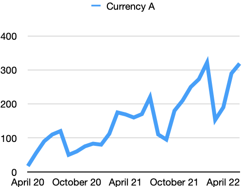
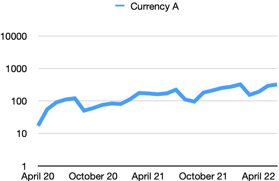
Logarithmic vs. linear scaling
The main lesson here’s that simplicity is the best policy, which brings us to scaling. Here, we want to take stock of two main scale options available to us: logarithmic and linear. The latter is quite easy to understand. Scale values are spread evenly along the y-axis, and provide a quick and easy comparison point.
Linear scales are used for many comparisons when values are in the same general range of each other — say monthly conversions or ad spend. These values should follow a pretty expected curve within an easily visualized range. See the bar chart below for an example.

No misleading data here! A classic bar chart is great for comparing data in similar ranges.
Logarithmic scales, however, are a bit more abstract and complicated. Instead of the y-axis following a normally distributed value scale, the y-axis values increase by the power of 10 (i.e. 1, 10, 100, 1000, etc.). As a result, this could lead to misleading visualizations if your audience isn’t properly informed or doesn’t have the necessary sophistication level in dealing with logarithmic scales.
When to present data using a logarithmic scale?
According to IBM, logarithmic scaling is best used when the data displayed covers a huge range of values. Think about the valuation of a cryptocurrency, for example. It is highly volatile and swings dramatically.
On a linear scale, these swings would be quite pronounced. In a logarithmic scale, though, the currency may reveal that it is actually a bit more stable over time - as long as you account for the real value range in which the currency moves.
And to give a real life example, logarithmic scales were often used during the Corona pandemic in 2020 and 2021. The reason is that a virus spreads exponentially. Exponential growth is better shown through a logarithmic scale.
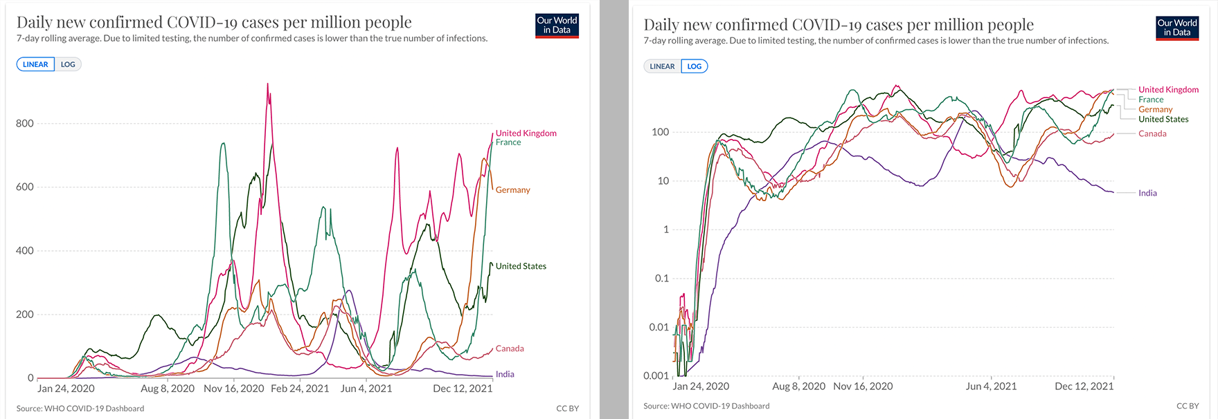
The 2 graphs above, from OurWorldInData, contain the same data visualized in 2 different ways. Left the linear scale, on the right the log scale.
Using the wrong chart type
One other example of how data visualization can be misleading is selecting the wrong graph or chart for the wrong application. As we’ve covered here, there are a plethora of visualization options available to us today. It’s important to keep in mind the story that the data is telling, and select the right graph or chart for the right application. For instance, using a distribution-style graph for a comparison is sure to confuse your audience.
Manipulating the y-axis
Beyond using potentially confusing logarithmic scales, your data visualizations could also mislead your audience should you truncate the y-axis. For instance, consider these 2 graphs showing website traffic over the source of a couple months:
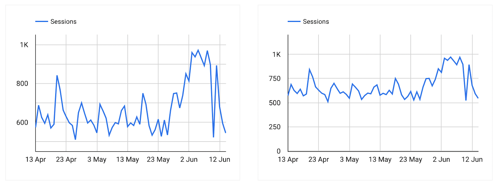
Same data, different insights: how the y-axis affects data visualization.
On the left graph, it appears that the last 10 days saw a high level of traffic. In fact, the traffic around June 3 looks like it was double the traffic of May 24. However, this visualization is actually misleading, due to a truncated y-axis that displays values beginning at about 500 sessions.
If we zoom the y-axis scale out to start at 0 sessions, as seen in the graph on the right, we actually see that the sessions are relatively stable. Sure, there are more sessions at the beginning of June, but it is not double the traffic as the left-hand graph implies. So, while both graphs show the same data, visualization choices have a large effect on how the viewer might interpret the data.
Most data visualization tools give you the ability to edit the y-axis. But with great editing power comes great responsibility. The responsibility to ensure your graphs are not misleading.
Skewed data = misleading visualizations
Beyond just the design of the graphs themselves, your data and statistics run the risk of creating misleading data visualizations.
As Mark Twain once wrote, “Facts are stubborn, but statistics are pliable.” But how could this be so? Well, there are a few sticking points.
One of the most common culprits for misleading data are outliers. These tricky little data points can heavily skew average values and compromise any hopes of finding correlations. While outliers can sometimes be identified in scatter plot charts, they can lead to misleading data visualizations very quickly. Particularly if you are working with very large data sets from many different sources, outliers can become the proverbial needle in a data haystack.
Luckily, there are a few strategies to identify these problem data points including sorting your data, running regression analysis, and more. You just need to remember to take a critical eye to your data, continually test, and don’t assume too much.
Which brings us to our final way that graphs and statistics can be misleading.
The human element
At the end of the day, data has to interact with humans. Messy, imperfect, and beautiful humans. While our interpretation of data can vary based on our perceptions and assumptions, so too can the collection, processing, and presentation of data.
A great example of this is market research. In this case, under-representing entire populations can greatly skew final data points and actions taken.
An historic example is the medical understanding of women’s cardiac health. According to a study in ScienceDirect, women are perpetually under-represented in clinical studies of cardiac health. As a result, most diagnoses and treatments of cardiac issues (including heart attacks) are greatly biased toward the symptoms and physiology of men.
In addition to under representation, many researchers and marketers may fall victim to hypothesis confirmation. In other words, they are seeking data that specifically supports their own opinion while erroneously discounting counterpoints in the data as outliers.
Cognitive bias
Each of these concepts contribute to the broader concept of cognitive bias — or the idea that our preconceptions influence our collection and interpretation of data. The bad news is that cognitive bias can influence many of the actions we take on a daily basis — and not just decisions that lead to misleading data visualizations.
While there are many ways to try to account for this bias, it’s important to understand that it is a part of us being human. We need to acknowledge that our data may contain these biases, but still do the best we can to remove our opinions and assumptions from the equation.
There is one more point at which the human element can influence visualizations to mislead. Let’s revisit the website session example from before. In the left-hand graph below, we see the sessions from April 13 through June 13. It shows a recent increase in sessions at the beginning of June. Perhaps this is due to the launch of a new ad campaign?

Misleading data can be as simple as choosing the date ranges to be shown.
However, if we pull back the date range to start a week earlier (as seen on the right), we actually see that the website experienced a slight overall dip in website sessions.
This is called cherry picking your data. In other words, you hand select the data points that can tell a better – more favorable – story. While this can be a useful strategy in some circumstances, it’s a slippery slope that often goes hand in hand with hypothesis confirmation.
Conclusion
In this blogpost we looked at some ways data visualizations can be misleading, and how to avoid creating misleading graphs and charts. By actively working to limit human bias in our data, being smart about our graph designs, and limiting the amount of represented variables, we can start a journey toward better data visualizations.
Want to learn more?
Our other blogpost goes into what data visualization actually is, how to create a good data visualization, and describes the difference between structured and unstructured data. If you’d like to dig deeper into data visualization techniques, you can also check out our webinar.