
Does the thought of reporting week send a shiver down your spine? You're not alone. Many marketers dread the days leading up to the deadline for reports. It's like running a marathon with no finish line in sight. Gathering data, analyzing results, creating a report to share with your manager or client – it can feel like a never-ending task.
Even those who use automation and visualization tools like Looker Studio often find themselves struggling. Why?
I believe that part of the reason reporting is such a daunting task is because many people try to use a single dashboard for multiple purposes. More specifically, they are using one dashboard for monitoring and reporting.
Monitoring and reporting are not the same. They're like apples and oranges, and trying to use one for the other is a recipe for disaster.
Monitoring: an eye for detail
To start with, monitoring is all about the details. While you may have some high-level charts in your monitoring dashboard, you will also want the ability to dive deeper into the data.
Let’s say, for example, that you work in a marketing agency. On the overview dashboard for your e-commerce client, you see a drop in sales. While that is an important thing to note, the real question is: Why did conversions drop?
That's when the real work starts. It's like being a detective, sifting through a sea of numbers to find the clues that will solve the case. You're looking at everything, leaving no stone unturned. With the right kind of dashboard, this doesn't have to take a lot of time. Just compare the current period with low performance to the previous period. You’ll want to pay close attention to the following:
- Did the conversion rate on the website drop?
- Which marketing channel brought in more (or less) traffic?
Even with the best dashboard, you might need to dive even deeper into the data. Which can mean that you use a Google Sheet or Excel spreadsheet to compare different numbers. Or, may you need to talk to someone who could explain that the sale period ended, which caused conversions to drop significantly.
A monitoring dashboard should provide near real-time data to allow for immediate action; highlight trends, anomalies, or deviations from expected performance; enable detailed drill-down into data for in-depth analysis; and offer customizable alerts for specific metrics reaching certain thresholds. It should contain real-time performance metrics, trend data over short intervals, detailed breakdowns, and operational metrics to ensure comprehensive oversight.
Reporting: the bigger picture
Let's say you found out why conversions dropped. The reason was that one of the creatives in the Facebook Ads campaign was suddenly disapproved, which meant that your audience was only seeing other, older creatives with a lower click-through rate.
Now, it's time for reporting, which you can take quite literally. You may simply generate a report on the phenomenon that is then sent to your client, your manager, or the CEO.
What do you think they want to see?
I’ll start with what they don't want to see:
- Details
- Countless tables and graphs
- A detailed description of all the data you looked at to figure out what happened
Instead, they will want to see the bigger picture. You need to share the main KPIs that drive the business. But good marketing reporting is not just about numbers. It's also about telling a story, guiding your audience through the data landscape.
You need to explain not just what happened, but also why it happened. Now, this might sound easier than it actually is. To explain what happened and why it happened, you need to have a real understanding of the data you're looking at.
And guess what? Reporting this story might require a different set of tools. You might create dashboards in Looker Studio or Tableau to present your data in a visually appealing and easy-to-understand format.
A reporting dashboard should summarize performance over a set period to show progress toward goals, highlight key performance indicators (KPIs) that align with business objectives, provide insights and context to data, explain why certain metrics are important, and be easily understood by people not deeply involved in the day-to-day operations.
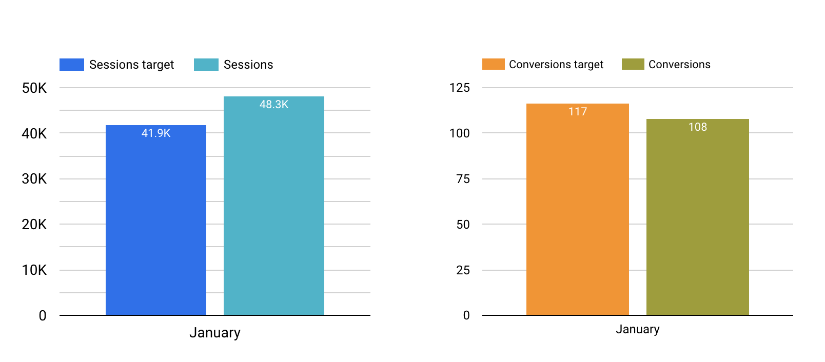
The two charts pictured here clearly show the number versus the expected number (the target) and could be a part of a reporting dashboard.
Separate your monitoring and reporting
So, what's the solution? Simple. Create a distinct report for your stakeholders and keep all the nitty-gritty data in your own dashboard or Google Sheet. It's like having a clean, organized workspace. Everything has its place, and everything is easier to find.
Remember, monitoring and reporting are two sides of the same coin. And sometimes, it makes sense to use different tools for each job. While a single dashboard can technically serve both purposes, it's not ideal due to the differing objectives and audiences. Separate dashboards ensure that each one is optimized for its specific purpose, offering focus, customization, and audience-specific design, making them more effective tools in their respective contexts.`
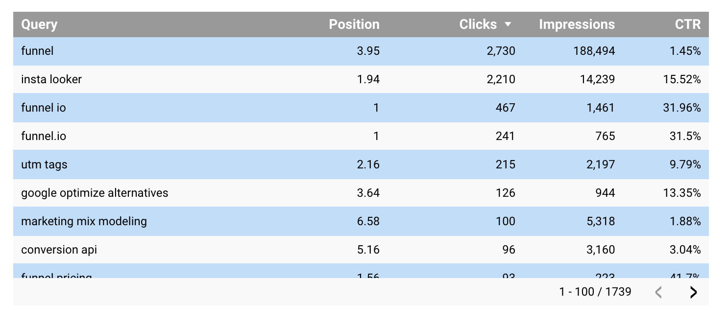
Specific, granular data like keywords and their positions in Google Search should (in most cases) not be a part of a reporting dashboard. But the example above could be part of a dashboard for monitoring SEO.
Beyond dashboards: the power of contextual reporting
While dashboards play a crucial role in both monitoring and reporting, they are not always the final answer to the reporting question. There are scenarios where a more tailored approach can significantly enhance the clarity and impact of your communication.
Consider this: instead of solely relying on live dashboards for reporting, you can capture screenshots from your dashboards and embed them into a slide deck or text document. This method allows you to surround the data with narrative and context. By adding annotations, explanations, and insights alongside your visuals, you transform raw data into a compelling story.
This approach ensures that the reader can see beyond the numbers and understands the factors driving those numbers. It's the difference between merely presenting data and truly communicating insights. You provide the “why” behind the “what,” enabling stakeholders to grasp the underlying dynamics at play.
Incorporating screenshots into a well-structured presentation or document also allows for greater flexibility in how information is presented. You can highlight specific areas of interest, draw comparisons, and create a logical flow that guides the reader through your findings. This method fosters a deeper engagement with the data, encouraging questions, discussions, and, ultimately, more informed decision-making.
The true goal of reporting is not just to present data but to enlighten and inspire action. By combining the immediacy and detail of dashboard data with the narrative power of a carefully crafted report, you create a richer, more nuanced understanding of your marketing efforts.