
We’ve all been there: sitting in front of a blank screen, trying to figure out how best to visualize and present your performance data. But where do you even begin? What kind of charts should you use? What colors?
For those without a keen design eye, creating a dashboard loaded to the teeth with juicy insights can be daunting. The plethora of possibilities can sometimes feel like quicksand dragging you down before you can even start.
For inspiration and expert pointers, we sat down with Alexis Miske, a senior business intelligence specialist for Digital Reach Agency, a Funnel Solution Partner.

Alexis Miske, senior business intelligence specialist at Digital Reach Agency
What’s the first step in data visualization?
Before delving into the intricacies of chart selection and design, it’s important to step back and consider the purpose of the dashboard you will create. Alexis asks herself three important questions:
- What is the purpose of the dashboard?
- What questions are you hoping to answer?
- How will this dashboard impact your daily work or your decision process?
“If you can envision how people will use the dashboard, you can already anticipate the type of information that is needed,” said Alexis.
For instance, if you create a dashboard for a stakeholder seeking a high-level activity summary (think of someone in a leadership role), you’ll want to cater this information accordingly. Aim for scorecards and quickly understandable graphs while avoiding complex multi-dimensional plots. If the dashboard is for a more technical team that is used to working in the details, though, those advanced graphics may be necessary.
Some dashboards need to answer very specific question. Defining these needs with your client early on is critical.
Setting the scope
When working with clients, as Alexis does, one great way to define the dashboard's purpose is to set a general scope. This also provides the opportunity for the team to define other requirements.
For instance, they may ask the client to confirm the branding requirements, like logo usage and color schemes. It’s also important for the team to understand how, and on what device, the dashboard will be viewed most (i.e., on a laptop, on mobile, on a tablet, etc.).
She is cautious, however, not to overpromise on what the dashboard can deliver if the client’s data is not up to snuff.
“A client may want a certain slice of data, but they only have 20% of the required data values,” Alexis said. “If they don’t have the data, the dashboard can only do so much.”
Where do the insights arise?
With the scope, purpose, and branding requirements in hand, Alexis and her team must start connecting all of the client’s data and performing quality assurances across it. It’s at this stage that some insights already start to surface.
“Sometimes you start to see patterns or other things during exploration,” said Alexis. “Besides the client’s intent, I have my own hypotheses and questions. Even in the exploration phase, I can begin answering some of those questions, and the broader picture starts coming into focus.
“That picture becomes clear when we create the visualizations. They really make the story come to fruition.”
Insider tips and tricks
Process and general guidelines are one thing, but we wanted to really dig in and get some of Alexis’ secret tricks and hacks. She did not disappoint.
Top visualization styles
Regarding design, Alexis likes to stick with the staple charts and graphs.
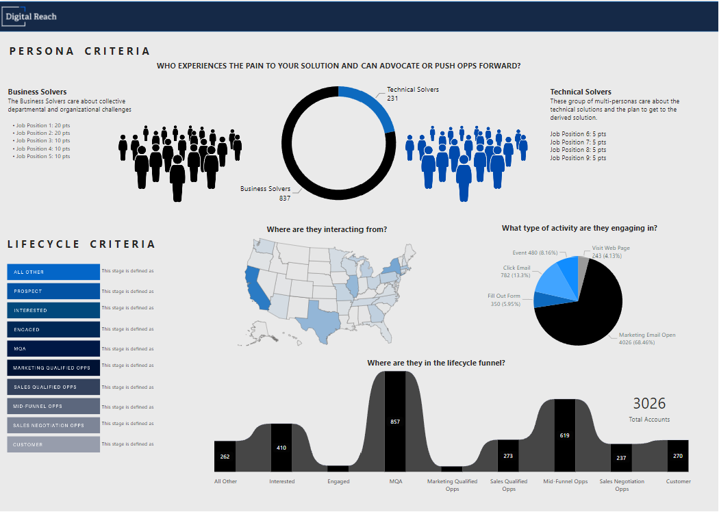
“I know people hate pie charts and donuts, but I like to keep it classic, honestly,” said Alexis. “Your audience doesn’t want to spend the time figuring out a box and whisker chart and other advanced stuff. It’s cool, but the information delivery is too complex.”
In her view, the basics are the easiest charts for everyone to understand, making even pie charts a good option. Particularly if a stakeholder is going to share the dashboard with someone else, Alexis hews to more universally understood icons and styles to make sure any unknown reader can understand it.
“The more advanced stuff, things with four or five dimensions, often requires someone to explain it,” Alexis said. “Pie and donuts serve a purpose — if you use them correctly.”
But, of course, if a client hates pie charts, she will use another easily understood chart in its place.
Amp it up
Alexis actually uses design software to help her dashboards come to life. Tools like Canva, Figma, MidJourney, and more can help elevate the design. She’ll even throw in stock images and gifs to liven things up.
Beyond giving her better design capabilities, this also reduces performance load when generating the dashboard.
“Instead of your dashboarding tool, Power BI in my case, trying to load a bunch of individual backgrounds, I can just have it pull in my single design file from Figma,” said Alexis. “This helps every dashboard load more quickly on the client side, and things run more smoothly.”
Stay inspired
Sometimes, developing interesting ideas for yet another dashboard can be hard. That’s when Alexis goes to her wells of inspiration.
“When I need inspiration, I go to YouTube and Pinterest,” she said. “I like design and being creative. When I see people making mind-blowing stuff, that inspires me. Then, I’ll start sketching and playing around with something that interests me. It could be anything, like Pokemon, and that will keep you engaged and inspired to try new stuff for clients.”
Dashboard for senior leadership
When designing dashboards for executives and company leaders, Alexis recommends keeping your designs simple and easily understood.
“Include a panel that opens up and provides a top-line summary,” she said. “And keep your big, important information front and center with the detail further to the bottom.”
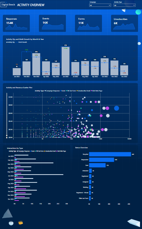
Placing scorecards at the top of a dashboard can be a great way to focus attention on top line numbers.
Quick hacks
Alexis also offered a couple of quick hacks to keep in your back pocket:
- “Titles and subtitles are really important,” she said. “And don’t be afraid to use helper icons over a visualization to explain what it is.”
- Avoid grid lines and opt for a clean background
- Highlight good or bad indicators with easily understood colors like green and red
- Keep your font sizes consistent
- Keep your color choices consistent and minimal
Handling advanced requests
While her general advice is to keep your dashboards as clean and simple as possible, there are times that Alexis receives requests for some more advanced visualization and information delivery. Luckily, nothing is too complex for her and her team.
“There’s nothing out there that’s super difficult visualization-wise,” Alexis said. “It just depends on your technical capability. The custom stuff isn’t hard to pull off if you have the right systems and templates.”
That being said, some more advanced visualizations may require some extra knowledge.
“If you’re interested in that advanced stuff, you’ll want to learn R or Python,” Alexis said.
She also reiterated that connecting any advanced visualizations back to the dashboard's purpose is important. You need to make sure that those graphs will be understood by your audience and serve up an important perspective.
In other words, don’t just show off that you can create those fancy visualizations.
What’s next?
While advanced visualizations (given the right context) are no match for Alexis’ prowess, she is curious about the possibilities that artificial intelligence could bring. Particularly, she wonders how automatically generated visualization and insights could affect her work.
“I think it will always require a human touch, but if you could build an AI system that automatically generates real-time insights with text annotations, I think that could be so cool,” said Alexis.
That ability to provide context around any insight or graph is why she believes humans will still have a role to play in the future. After all, imagine an AI that can create incredibly complex visualizations. The reader still needs to understand it. So, it seems humans and pie charts will stick around a bit longer.
Up next: What is data storytelling, and how can it make your presentations magical?