
Here's a scenario to consider: you recently got put in charge of a marketing campaign for one of your firm's biggest clients. This is a huge opportunity, so you want to impress everyone.
There's just one problem: conversions have dipped since you took over the campaign.
The month before you got the promotion, the campaign converted 1,000 people for every 5,000 interactions. This month, you got 600 conversions and 2,500 interactions.
You've created plenty of data visualizations, so you know how to make this month's results look even better than last month's. You just need to use percentages to show that 24% of interactions converted since you took over the campaign. That's a notable improvement from last month, when 20% of people who interacted with your campaign assets converted.
Your dilemma is clear. You could choose to visualize the data in a way that makes you look good to your managers and the client. Or you could visualize the data in a way that shows a significant dip in performance. Do you take the option that gets you praise or the one that represents the campaign's numbers accurately and potentially offers insight into how you can make improvements?
To make the right decision, it helps to gain a deeper understanding of ethics in data visualization.
Why marketers need ethical data visualization
Data visualization should make it easier for stakeholders to understand your findings. Long lists of numbers don't mean much to the human brain. Representing information as charts, plots, and graphs makes data easier to comprehend.
In fact, data visualizations in marketing matter so much that 92% of professionals say it could help them make better decisions.
At least 89% of these marketers also say that their managers prefer viewing reports that include data visualization. Maybe you have the superhuman ability to glean meaningful insights from data points, but you can't expect your manager to share that power.
Data visualization makes information easier to digest, however, it's not without its pitfalls. When data analysis doesn't show the trends you hoped for, you could feel tempted to choose a data visualization technique that obscures the results.
Learning more about the ethical considerations involved in data visualization should help you understand the negative long-term impacts of misrepresenting data.
Data visualizations don't always tell the truth
Data is objective, but people can use data to mislead others. Just the way you present data can make a point seem more valid than it truly is. Data visualization gives unethical marketers another tool to mislead their colleagues and consumers.
That's why every marketer needs to learn about ethical data visualization and the unethical ways some people weaponize visuals to skew underlying data.
Below, we'll cover some of the most important factors in ethical data visualization. You'll also learn about examples of ethical data visualization... and their unethical counterparts.
The ethical landscape of data visualization
Turning your data analysis into a data visualization forces you to make some choices about how you represent information. Before you start visualizing data, take some time to learn about the common mistakes people — including data visualization professionals — make simply because they don't think about how presentation can influence how audiences perceive otherwise accurate data.
Keep these considerations top of mind during the visualization process so you can avoid misleading your audience.
Also, pay attention to the benefits you might reap by taking unethical approaches. It's much easier to avoid temptation when you know how short-lived the advantages are.
Misleading scales
Truncating a graph's y-axis can exaggerate differences by making small variations seem much more significant than they are.
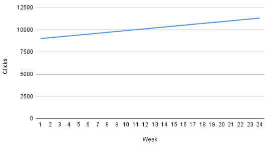
For example, if your campaign typically gets about 9,000 (plus or minus a few hundred) clicks per week, you could create a data visualization that uses 100 increments on the y-axis. This data visualization will make it look like your numbers have increased significantly. In reality, 100 clicks here and there don't mean much. It's usually more accurate to use 1,000-click intervals to show that engagement has remained relatively flat over time.
The graph below shows the weekly clicks for a marketing campaign.
After truncating the Y-axis, this is what the graphs looks like now. 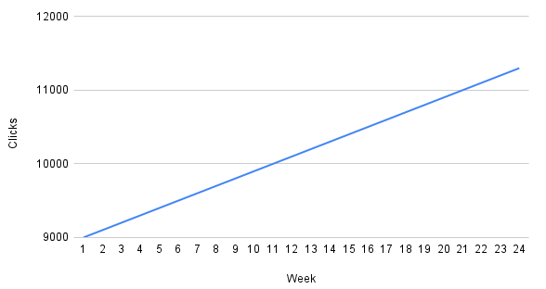
What's the benefit of this data visualization technique? You look like you're getting more attention than you are.
What's the downside? You mislead managers and clients, which could be detrimental to the campaign and your career.
Manipulating axes
Manipulating an axis can exaggerate or diminish the impact of data points to make trends look unrealistically obvious.
An unethical approach could involve removing ticks from a bar graph's y-axis. Once you've removed the context, you can make the differences between two data sets look as big or small as you want.
If your data visualizations don't have a scale, there's a good chance someone will feel misled by your work.
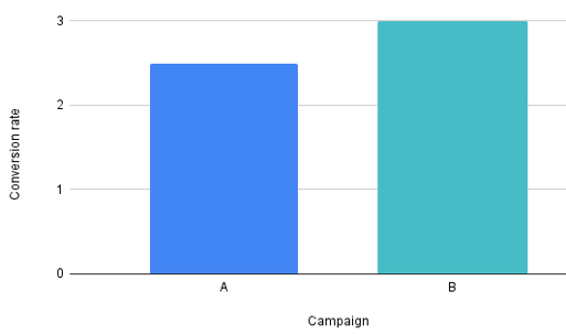
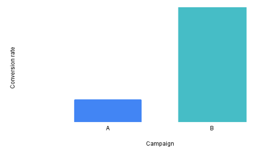
Let's say you have two digital marketing campaigns, Campaign A and Campaign B, and you want to compare their conversion rates over a period of time. Below you see a before and after example of when you manipulate the Y-axis and remove the scale for context.
The graph below shows the conversion rates for campaign A versus B.
After manipulating the Y-axis and removing the scale, we can now give the impression that campaign B performed much better.
What's the benefit of this data visualization technique? You can manipulate your presentation to get any result you want.
What's the downside? It's a pretty obvious ruse that thoughtful people will notice. Even if it's an honest oversight on your part, misleading graphs will make people wonder whether you intended to mislead them.
Cherry-picking data
Let's say you conducted thorough research and collected quality data. Now, you don't like what some of the data says about the product you want to promote. You could cherry-pick the data that supports your position or present all of the data in a way that gets stakeholders to agree with you.
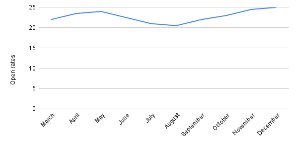
Let's say you're a digital marketer tasked with analyzing the performance of an email marketing campaign over the course of a year. Your goal is to showcase the success of the campaign to stakeholders. However, instead of presenting the campaign's performance as a whole, you selectively choose data points from the most successful months to highlight its success.
Below we can see the open rates for the email campaign in question. As you see in the graph below, it didn't perform so well in the first two months of the year.
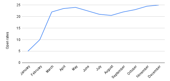
Now when we remove the January and February data, the graph looks much better.
What's the benefit of this data visualization technique? You might trick some people into supporting the product you prefer. If you're lucky, the product might perform better than expected in the market.
What's the downside? Cherry-picking data isn't misleading. It's lying. You've undermined data accuracy and weeks of hard work. Eventually, the truth will come out. It could cost you your job.
Biased sampling
You have a survey you want to distribute to your target population. Instead, you give the survey to people who fit a specific demographic. Now, you have skewed, unreliable data that you could look even more convincing through data visualizations.
What's the benefit of this data visualization technique? It might save you some time or give you the results you expect.
What's the downside? It's an incredibly lazy way to conduct marketing research, and it will only make your job harder in the future. Collect unbiased data now so you can build a strategy that gets results.
Incomplete data
You have a full dataset, but only some of the data points support your desired outcome. The unethical approach might involve creating a data visualization that excludes those inconvenient data points.
What's the benefit of this data visualization technique? Like many unethical data visualization examples, you could get short-term benefits by pushing your agenda.
What's the downside? Ignoring data is the same as ignoring reality. How could excluding data ever lead to a successful campaign? You'll almost certainly hurt the campaign, your reputation, and your career.
Inconsistent units
Mixing units on the same graph makes it nearly impossible for people to understand the data, especially when you don't provide clear labels. For example, you might want to visualize data where some points are in thousands and others are in millions. If you don't label them clearly, how could anyone decipher the meaning accurately?
You can avoid misleading people by making two graphs that use unique, consistent units.
What's the benefit of this data visualization technique? Probably not much. Expect to feel embarrassed when someone asks you to clarify what the numbers mean.
What's the downside? There aren't many potential upsides other than the slim chance that you will feel good about fake results. That isn't worth much.
Overlaying data without context
Adding different types of data to the same visualization can offer insights that lead to success. For example, you might want to show a correlation between money spent on marketing and higher conversions.
Without context, though, it's a completely different story. And a very confusing story at that. For example, you could create a data visualization that shows the number of product A sold and the amount of revenue earned from product B. If these data points have anything to do with each other, the correlation is unclear.
What's the benefit of this data visualization technique? There probably isn't a benefit, which is why marketers should pay close attention to their visualizations to avoid mistakes like this.
What's the downside? You make yourself look unprofessional by distributing a meaningless data visualization.
Navigating the fine line
You want to create impactful visuals while ensuring data accuracy and avoiding ethical challenges. Sometimes, though, you run into complicated questions when you create graphics. How can you follow ethical guidelines when you legitimately aren't sure how your approach might influence the audience?
Seek feedback from diverse audiences
Getting feedback is one of the most important things you can do to ensure your visualizations communicate data as objectively as possible.
Start by asking your colleagues. That might include talking to:
- Data scientists
- Other marketing professionals
- Members of the sales team
- Upper management
It's also important to consider diversity when asking colleagues for their feedback. Make sure your group includes people with different ethnicities, races, gender identities, and backgrounds.
Don't restrict your request to data professionals, though. While it's great to get feedback from a data pro, you need responses from diverse audiences with different levels of education and experience. Ethical data should convey information just as easily to a layperson as a professional.
Use trustworthy visualization tools
Some data visualization tools work better than others. Funnel's favorite tools for great power visualization include:
- Funnel Dashboards
- Looker Studio
- Looker
- Tableau
- Microsoft Power BI
- Google Sheets
Visit our blog post, The best data visualization tools - according to Funnel, to learn more about why we prefer these options.
The role of transparency
You can't always create a perfect visual for your marketing data. Over the course of a career, you'll probably make a few mistakes. Embracing transparency, though, helps minimize the negative effects of those mistakes.
When possible, give stakeholders access to your data so they can review the information independently. It also helps to include where the data comes from, when you collected it, and how you analyzed the numbers.
Better data for better visuals
Marketing success begins with reliable data sources. Luckily, you don't need a degree in data science to conduct good research and create clear graphics. Funnel makes it easy for you to connect all of your data sources so you get a straightforward view of every campaign's performance.