
Data visualization is an essential tool for digital marketers to communicate the value of data insights to stakeholders and team members. It helps identify what marketing activities or campaigns generate revenue, what doesn't, and where optimization is required.
As a digital marketer, it is crucial to be an effective communicator in every aspect, including demonstrating the value of your work. One of the best ways to achieve this is through high-level marketing dashboards and reports.
Creating impactful data visualizations, though, isn’t a walk in the park. It requires a combination of data proficiency and design skills. But don’t panic, you don’t need to be a data analyst or designer to get this right. You simply need to understand some basic data visualization techniques and get your hands on the right tools. Let’s dig in.
Why data visualization?
The primary purpose of data visualization (and exploration) is to transform data into actionable marketing intelligence, enabling you and your team to make better, more informed decisions.
With vast amounts of unstructured and complex data constantly submerging you, collecting, organizing, and visualizing that data can be tricky. Yet, with the right tools and understanding of what you want to look at, those marketing dashboards will help you stay in control of your marketing.
Data visualization is a useful tool that can come in handy in various situations. For instance, consider the data table below, which shows that datasets 1, 2, 3, and 4 have the same mean, variance, and correlation. However, one may make the mistake of assuming that these datasets would produce identical-looking graphs when visualized.
Visualizing datasets in Anscombe's Quartet enables us to distinguish differences in the data more easily. By visualizing numerical data, we can easily identify patterns and correlations that would otherwise be difficult to find. This is why data visualization is critical. It helps us uncover relationships in data that would otherwise remain hidden.
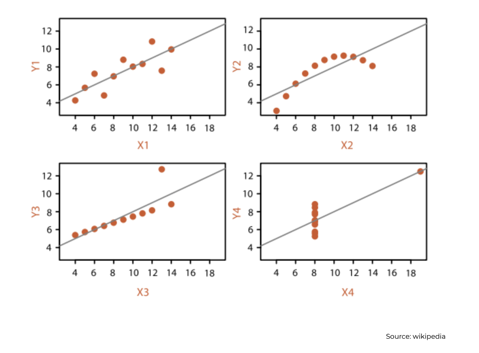
Francis Anscombe's scatter plots show the value of visualizing data.
Let's imagine that you're analyzing the performance of your marketing across multiple channels. If you're dealing with raw and unstructured data, optimizing your marketing can be a daunting task. However, if you can organize and visualize that raw data well, it becomes much easier to identify patterns and deviations. This, in turn, allows you to quickly spot any red flags and make informed decisions on when and how to act.
Helping your audience focus
Another powerful data visualization technique is ensuring your audience can quickly and easily comprehend the information or message you are conveying.
One way to achieve this is by creating dashboards and reports that are more human-friendly in terms of how we process data.
A critical concept to familiarize yourself with is 'pre-attentive attributes', which are things that our brain tends to focus on faster than others.
Let's consider an example before we delve deeper. In the image below, try to count all the 8s in 30 seconds. Go!
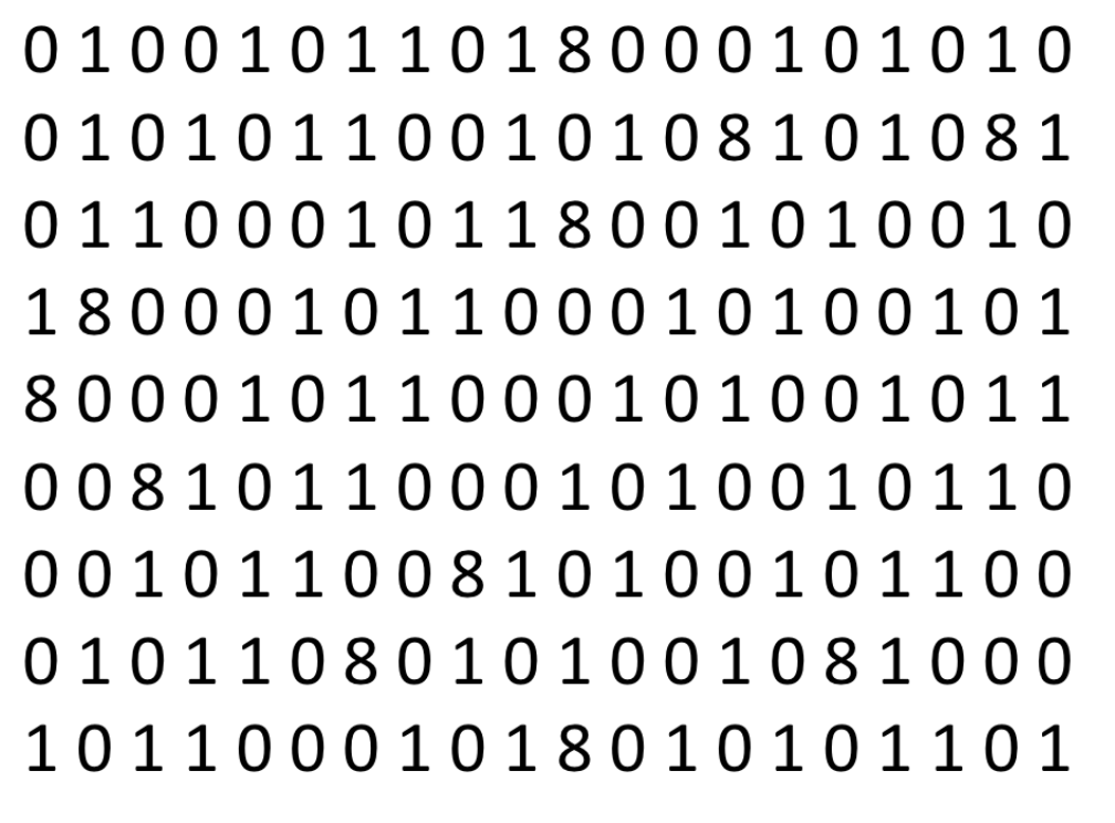
How did you fare? It was quite a challenging task, wasn't it?
Now, let's take the same data, but this time, the 8s are a different, brighter color, such as red.
Ready for another 30 seconds? Go ahead.
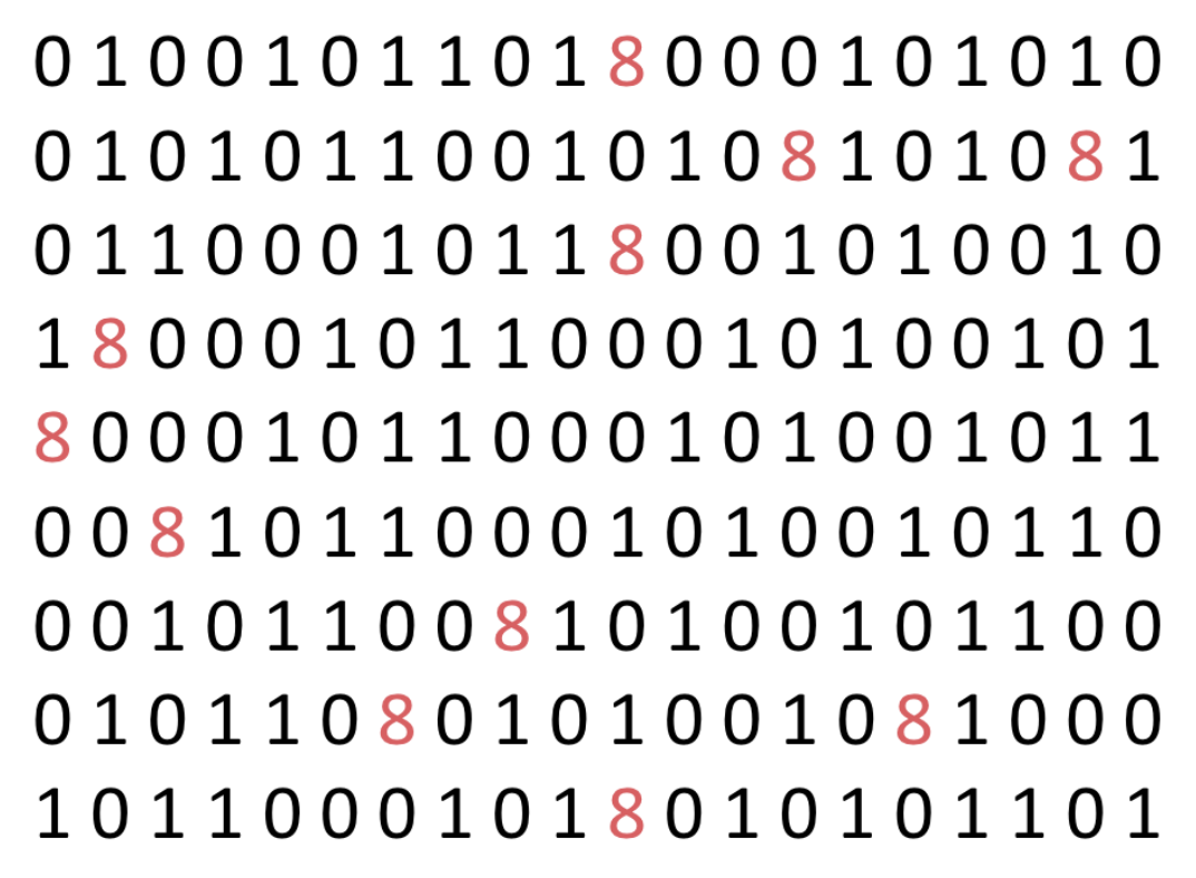
Did you improve this time? Most likely, yes, because we used the power of color to guide your focus.
3 pre-attentive attributes (data visualization techniques)
Within popular data visualization techniques, there are three common pre-attentive attributes you can start using when presenting data: color, size, and position. Let’s take a look at each one.
Color
The important thing to remember about color is that too much will actually make data analysis harder. Colors can be visually appealing, but excessive use can be overwhelming, particularly in a report or a dashboard.
For example, the table below shows the top three advertising platforms per state using multiple bright colors with varying opacities. Due to the confusing array of colors and opacities, anyone can have some difficulty interpreting the data and making any conclusions.

Everything in moderation: too much color makes data visualization harder.
Now, take a look at the same data below. By removing the color on the fourth and fifth rankings and using only one color with varying opacities for the top three positions, the table becomes much easier to read. This way, it is evident that Google and Facebook are by far the preferred channels in most states, as opposed to Bing, Twitter, and Outbrain. You could draw the same conclusion in the first table, of course, but the multicolored table is distracting as opposed to aiding the viewer interpret the information.
|
State |
|
|
Bing |
|
Outbrain |
|---|---|---|---|---|---|
|
Arizona |
1 |
2 |
3 |
4 |
5 |
|
Mass |
1 |
2 |
5 |
4 |
3 |
|
Vermont |
2 |
1 |
5 |
4 |
3 |
|
Misconsin |
3 |
2 |
5 |
1 |
4 |
|
Washington |
1 |
2 |
5 |
4 |
3 |
|
Georgia |
4 |
5 |
4 |
2 |
1 |
|
Virgina |
3 |
1 |
2 |
4 |
5 |
|
California |
2 |
3 |
4 |
5 |
1 |
|
Ohio |
1 |
3 |
5 |
2 |
4 |
|
Iowa |
2 |
3 |
5 |
1 |
5 |
Data analysis is easier with a smaller color palette.
Size
Data visualization can be simplified by using size to highlight larger datasets. To visually represent larger datasets, they can be made larger than others on a chart. This means that the bigger the dataset, the bigger the visual representation.
For instance, the chart below shows the population of different states, with California having the largest population, followed by Texas, and so on. The sizes of the bubbles help communicate the relative weight, population-wise, of each state.
If you intend to quickly communicate how big California’s population is relative to other states, then this visualization does it effectively. However, if you want to visualize and communicate how big the populations are across all states, a bar chart organized in descending order would probably be a better visualization choice.
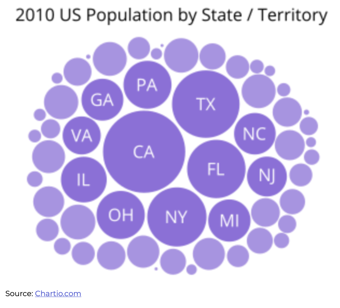
The bubble chart is a data visualization technique that's useful for quick overviews.
Source: A complete guide to bubble charts
When it comes to size, the important thing to note is that if you want to draw attention to smaller datasets, you shouldn't enlarge them. Instead, you can keep them small and use a brighter color that stands out. You can also consider greying or darkening the other bubbles that you don't want your audience to focus on.
Position
"Location, location, location" is not just important in real estate. It also applies to dashboard graphics.
By strategically placing data points, you can guide your audience's eye and demonstrate relationships between datasets. You can use the position of your data points to establish a visual hierarchy and indicate where your audience should look for the most interesting or important information in your report.
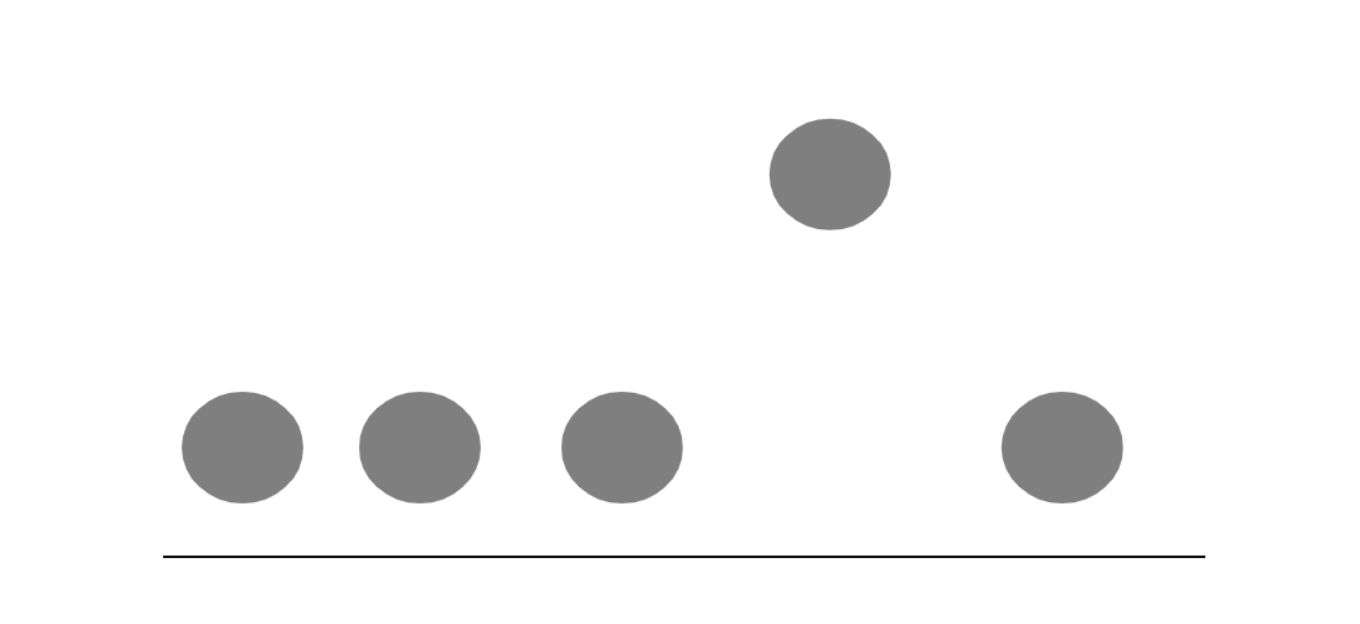
Take a look at the image below. How would you interpret the information presented? The visual displays three circles in a row, followed by a fourth circle standing separately above them, and then a fifth circle at the same level as the first three. Based on this, you can deduce that the fourth circle is an outlier or something your presenter wants you to pay attention to.
Creating a chart will sometimes automatically result in something like that. Here is an example:
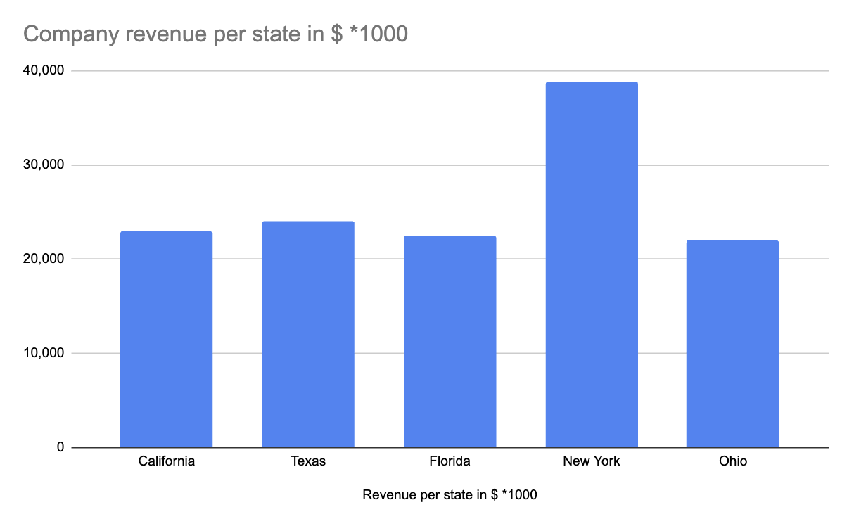
Bar charts are a versatile data visualization technique.
Other useful pre-attentive attributes to try
We have covered three important pre-attentive attributes of data storytelling: color, size, and position. However, several other data visualization techniques and methods can also be used to draw attention to data insights and improve the user experience of your data visualization. You can experiment with length, width, orientation, size, shape, enclosure, position, grouping, color hue and intensity – just to name a few.
Quick tip: Think about what you want your visualization to achieve, then use these principles to convey your message effectively.
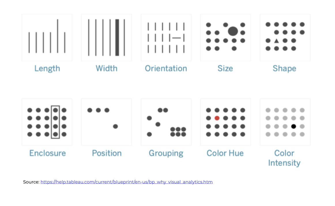
Different data visualization techniques. Source: Why Visual Analytics?
Now that we have understood the role of data visualization and pre-attentive attributes, let's take a look at different chart types. This will help us get a basic understanding of when to use them within your dashboards and reports. So, let's dive in!
Different chart types for your data visualization
A line chart (aka: line plot or line graph)
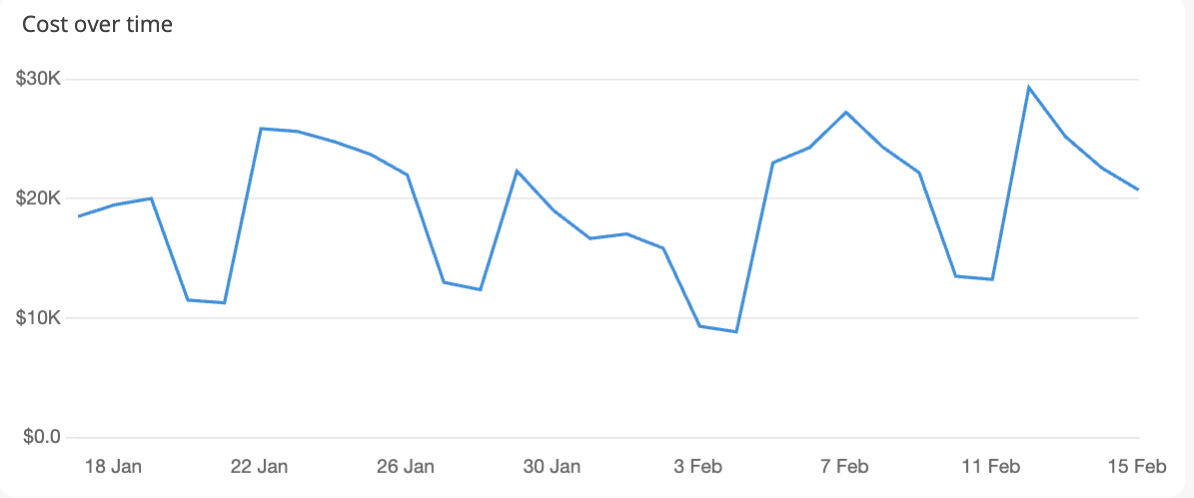
A line chart is a graph that shows a set of data points connected by straight line segments. It is a popular method of visualizing changes over a period of time in various fields. Line charts provide a clear and concise representation of patterns of change and are easy to comprehend at a glance due to their precision, compactness, and clarity.
In the example below, we see the amount spent on digital advertising per day. This could give the CMO a good overview and control of how much his performance team are spending over any specific time period. Teams could also set up alerts if they go above budget.
Line charts are best for:
- Tracking changes over time: Whether you're monitoring sales trends, stock prices, or website traffic, line charts excel at showing how values evolve over a period.
- Comparing multiple datasets: By plotting multiple lines on the same chart, you can easily compare how different variables change in relation to each other. For instance, you could use a line chart to compare the performance of different marketing campaigns over time.
When to Avoid a Line Chart
While line charts are versatile, they're not always the best choice. Consider using other visualizations when:
- You have too many data points: Overcrowding a line chart with numerous data points can make it difficult to interpret. In such cases, consider using a scatter plot or a bar chart.
- You want to compare discrete categories: If you're dealing with categorical data (e.g., product types, regions), a bar chart might be more appropriate as it can visually separate the categories.
A bar chart
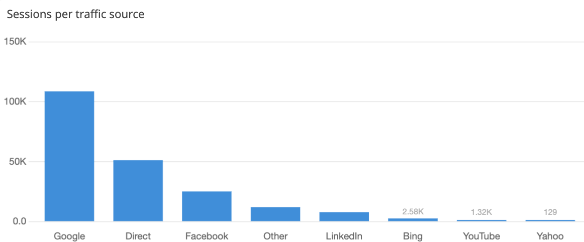
Bar charts are a type of chart that represent categorical data using rectangular bars. The length and height of these bars correspond to the values being represented. Whether vertical or horizontal, these charts make it easy to compare visual elements within the same category, such as the number of sessions by traffic source. Due to their simplicity and clarity, bar graphs are easy to understand and interpret. A good idea when presenting bar charts is to organize the data either in ascending or descending order.
Bar charts are great for:
- Comparing values across categories: Whether you're analyzing sales data, survey results, or demographic information, bar charts provide a clear visual comparison of different groups.
- Showing the distribution of categorical data: By arranging the bars in ascending or descending order, you can easily see the frequency of different categories within a dataset.
When to avoid bar charts
While bar charts are versatile, they may not be the best choice in every situation. Consider using other visualizations when:
- You have too many categories: Overcrowding a bar chart with numerous categories can make it difficult to read. In such cases, consider grouping categories or using a different visualization like a pie chart.
- You want to show changes over time: If you're tracking data that evolves over a period, a line chart might be more suitable for visualizing trends.
A stacked column chart
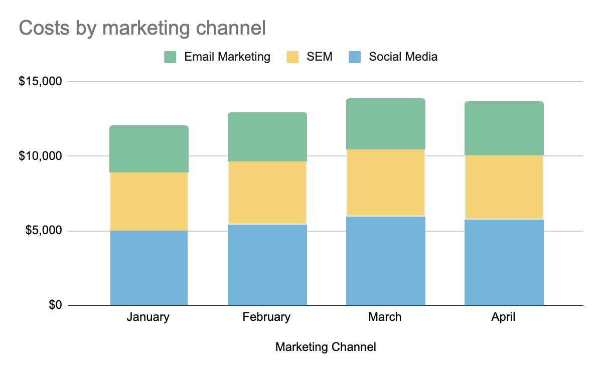
A stacked column chart is a visual representation that allows you to compare parts and wholes over time or across categories. In this chart, data series are stacked vertically on top of one another. The major advantage of using a stacked column chart is that it makes it easy to assess changes over time by allowing you to compare total column lengths.
In the example below, we have three marketing channels: Social Media, SEM, and Email Marketing, along with their corresponding monthly expenses for four months - January, February, March, and April. This visualization is helpful in comparing both the total marketing expenses over time and the distribution of expenses across different channels for each month.
Stacked column charts are great for:
- Comparing parts and wholes: If you want to analyze how different components contribute to a total value, stacked column charts provide a visual breakdown.
- Showing changes over time: By tracking the changes in the height of each stack, you can easily observe how the composition of the whole changes over time.
- Analyzing the distribution of categorical data: Stacked column charts can help visualize the distribution of different categories within a dataset.
When to avoid stacked column charts
While stacked column charts are useful, they may not be the best choice in every situation. Consider using other visualizations when:
- You have too many categories: Overcrowding a stacked column chart with numerous categories can make it difficult to interpret. In such cases, consider using a grouped bar chart or a pie chart.
- You want to compare individual categories directly: If you're primarily interested in comparing the values of individual categories without considering the total, a simple bar chart might be more appropriate.
Pie charts
Pie charts may not be as precise as other graph options, since users often find it challenging to accurately gauge the size of each slice. Although they offer quick scanning, identifying smaller slices and reducing their scalability can be difficult. (In fact, we wrote a whole blog post on why we're not the biggest fan of pie charts.)
However, there are some situations where a pie chart can be useful. For instance, let's consider a scenario where you are managing a digital marketing campaign for an e-commerce website and using multiple channels such as organic search, paid search (PPC), social media, email marketing, and referral traffic. In such a case, it is essential to know which channels are bringing the most traffic to your website so that you can allocate your resources effectively.
To obtain this information, you can create a pie chart, where each segment represents the percentage of traffic generated by each channel. This data visualization will provide a clear understanding of the relative contribution of each marketing channel to overall website traffic.
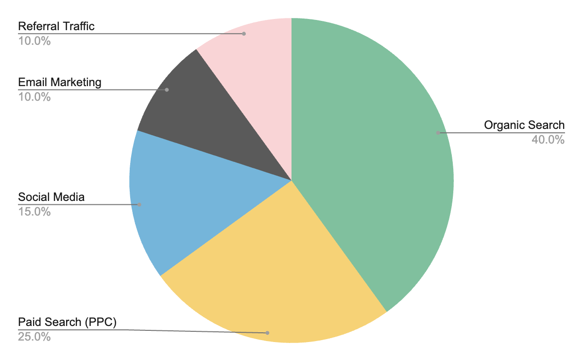
Pie charts aren't always the easiest data visualization to decipher, but in the example above, we get a good overview of contributions for marketing traffic.
Pie charts can be useful when:
- You want to show proportions of a whole: Pie charts excel at representing how different categories contribute to a total. For example, they can illustrate the composition of a budget, the distribution of a population, or the market share of different brands.
- You have a limited number of categories: Pie charts are most effective when you have fewer than five categories. A larger number of slices can become difficult to distinguish and interpret.
Consider using other visualizations when:
- You need precise comparisons: If you require accurate comparisons of values, bar charts or line charts are often more suitable.
- You have many categories: Pie charts can become cluttered and difficult to interpret with a large number of categories.
- You want to show changes over time: If you're tracking data that evolves over a period, line charts or stacked column charts are better suited for visualizing trends.
Related reading: Why you shouldn’t use pie charts
Sparklines
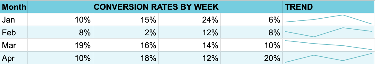
Sparklines are small charts embedded within worksheet cells, visually presenting data trends, effectively revealing patterns, and highlighting maximum and minimum values, despite their lack of scale.
For example, if you wanted to show trends in a metric, such as conversion rates on your website over the months, it would look something like what is shown below. This sparkline chart provides a quick overview of how conversion rates have been trending, allowing viewers to discern patterns and changes at a glance.
When to use sparklines:
- You want to display trends in a compact space: Sparklines can fit within a tight layout, making them ideal for dashboards, tables, or reports where space is limited.
- You need to visualize data quickly and easily: Sparklines provide a simple, at-a-glance view of trends, making them easy to understand and interpret.
- You want to compare multiple data series: By placing multiple sparklines side by side, you can easily compare trends across different datasets.
Sparklines aren't the best when:
- You need precise measurements: Sparklines are not designed for precise data analysis. If you require accurate values and comparisons, use a full-sized line chart.
- You want to highlight individual data points: Sparklines focus on trends, not individual data points. If you need to emphasize specific values, use a scatter plot or bar chart.
- You have complex data: Sparklines are best suited for simple, straightforward data. For more complex datasets, consider using other visualizations that can provide more detailed insights.
Scatter plots
Scatter plots visualize two-dimensional data using dots representing values for two variables plotted along the x- and y-axes. These plots, often called correlation plots, demonstrate relationships between variables.
In a digital marketing context, you might use a scatter plot to examine the relationship between advertising spend and the number of leads generated. This visualization allows you to quickly see if there's any correlation between the two. If there's a positive correlation, you would expect to see points clustering in a pattern where higher advertising spend is associated with more leads generated.

When to use scatter plots:
- You want to examine the relationship between two variables: Scatter plots can reveal patterns, trends, and correlations between the variables.
- You have a large dataset: Scatter plots can handle large amounts of data, making them useful for exploring complex relationships.
- You want to identify outliers: Outliers, or data points that deviate significantly from the general trend, can be easily spotted on a scatter plot.
Consider using other visualizations when:
- You have categorical data: Scatter plots are designed for numerical data. If one or both of your variables are categorical, consider using a bar chart or a pie chart.
- You want to show changes over time: If you're tracking data that evolves over a period, a line chart might be more appropriate for visualizing trends.
- You need to compare multiple categories: If you want to compare values across multiple categories, a bar chart or stacked bar chart might be a better choice.
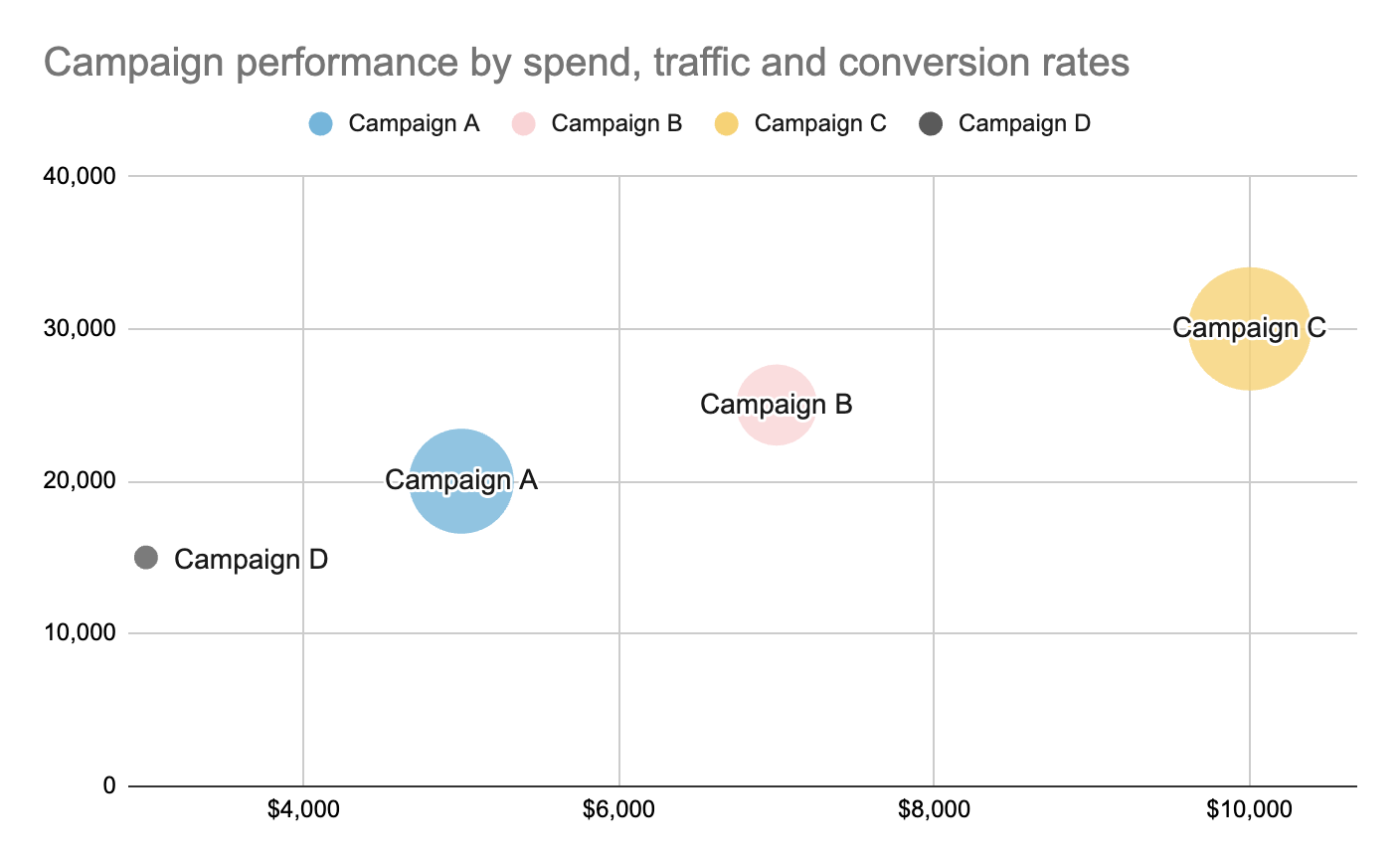
Bubble charts
Bubble charts are a variation of scatter charts that replace data points with bubbles whose sizes convey an additional dimension of the data set. Although visually engaging, bubble charts require substantial mental effort to interpret and are thus used sparingly.
Let’s look at made-up scenario to explain how you would use such a chart. Let’s say a marketing analyst wants to compare different marketing campaigns based on three metrics: advertising spend, website traffic generated, and conversion rate. Using a bubble chart, they can plot each campaign as a bubble on a two-dimensional coordinate system where the x-axis represents advertising spend, the y-axis represents website traffic, and the size of each bubble represents the conversion rate. This allows for a visual comparison of campaigns based on these three metrics simultaneously. Campaigns with larger bubbles would indicate higher conversion rates, while their position on the x and y axes would show their advertising spend and website traffic, respectively.
When to use bubble charts:
- You want to visualize three variables simultaneously: Bubble charts allow you to represent the relationship between two variables while also indicating the magnitude of a third variable.
- You want to highlight differences in magnitude: The size of the bubbles can be used to emphasize differences in the values of the third variable.
- You have a large dataset: Bubble charts can handle large amounts of data, making them useful for exploring complex relationships.
When to avoid bubble charts:
- You have too many bubbles: Overcrowding a bubble chart with too many bubbles can make it difficult to interpret. If you have a large number of data points, consider using a scatter plot or a heatmap.
- You want to compare precise values: Bubble charts are not as precise as other visualizations when it comes to comparing exact values. If you need to make precise comparisons, consider using a bar chart or a line chart.
- You want to show changes over time: If you're tracking data that evolves over a period, a line chart might be more appropriate for visualizing trends.
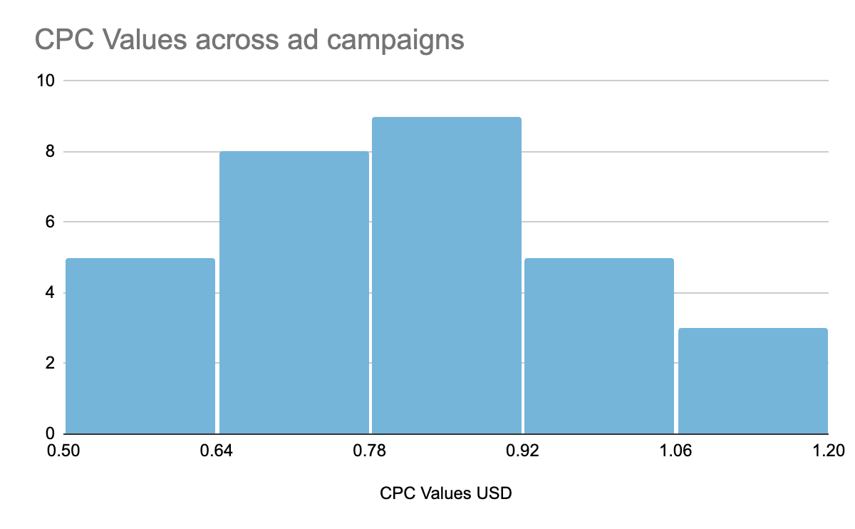
Histograms
Histograms portray frequency distributions of numerical data points, offering an approximate representation of data distribution. Distinct from bar charts, histograms represent the data point ranges rather than categorical variables.
Scenario: Let’s say a digital advertising manager wants to analyze the distribution of CPC values across multiple ad campaigns to understand the range and frequency of CPC values. They could create a histogram to visualize the distribution of these CPC values:
- The x-axis represents the CPC values.
- The y-axis represents the frequency or count of CPC values falling within each bin.
Using the provided data, they could create a histogram to visualize the distribution of CPC values across ad campaigns. The histogram will then show how many campaigns fall into different CPC value ranges, helping the advertising manager understand the spread and concentration of CPC values.
When to use histograms:
- You want to understand the distribution of a continuous variable: Histograms can reveal the shape, center, and spread of the data.
- You want to identify outliers: Outliers, or data points that deviate significantly from the general trend, can be easily spotted on a histogram.
- You want to compare distributions: Histograms can be used to compare the distributions of different datasets.
When to use another type of data visualization:
- You have categorical data: Histograms are designed for numerical data. If your data is categorical, consider using a bar chart or a pie chart.
- You want to show changes over time: If you're tracking data that evolves over a period, a line chart might be more appropriate for visualizing trends.
- You need to compare precise values: Histograms can provide a general overview of the distribution but may not be as precise as other visualizations when it comes to comparing exact values.
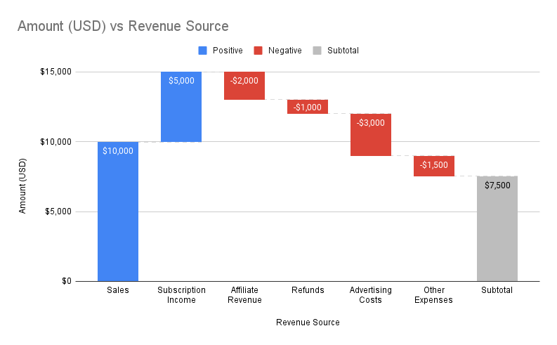
Waterfall charts
Waterfall charts reveal cumulative effects of sequentially introduced positive or negative values, making them ideal for illustrating changes over time or between categories.
You start with a bar that shows the initial value and begins from a zero base. Next, you would have a few bars that appear to be suspended in space - these are intermediate values that represent positive and negative changes to the initial value. These intermediate values can be based on time or category. Finally, you would have an ending bar that represents the final value and takes into account the effects of all the intermediate values displayed.
Scenario: Let’s say a digital marketing manager wants to analyze the return on investment (ROI) for a recent marketing campaign by breaking down the revenue generated and understanding how different expenses and revenue sources contribute to the overall ROI.
In this example:
- Revenue sources such as sales, subscription income, and affiliate revenue contribute positively to the total revenue.
- Expenses such as refunds, advertising costs, and other expenses contribute negatively to the total revenue.
Using a waterfall chart, you can visualize how each revenue source and expense contributes to the overall ROI. The chart would start with the initial total revenue at the top, and each positive revenue source would be represented as a bar extending upwards, while each negative expense would be represented as a bar extending downwards. The final bar would represent the total ROI.
This visualization helps the digital marketing manager to understand the profitability of the marketing campaign by highlighting the sources of revenue and expenses that have the most significant impact on the overall ROI. This allows for quick identification of areas where improvements can be made to optimize ROI.
When to use waterfall charts:
- You want to show the cumulative effect of a series of changes: Waterfall charts can illustrate how a starting value is affected by a series of additions and subtractions.
- You want to analyze financial data: Waterfall charts are commonly used to analyze financial statements, such as income statements and balance sheets, to show how net income or total assets are affected by various factors.
- You want to track progress towards a goal: Waterfall charts can be used to track progress towards a goal by visualizing the cumulative effect of positive and negative contributions.
When to avoid waterfall charts:
- You want to compare individual values: Waterfall charts focus on the cumulative effect of a series of changes, not on comparing individual values. If you need to compare individual values, consider using a bar chart or a line chart.
- You have a large number of data points: Waterfall charts can become cluttered with a large number of data points. If you have a large dataset, consider using a stacked bar chart or a line chart.
- You want to show changes over time: If you're tracking data that evolves over a period, a line chart might be more appropriate for visualizing trends.
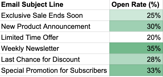
Heat maps
Heat maps represent data matrix values using colors, simplifying complex numerical data into easily understandable visualizations. These maps excel in cross-examining multivariate data sets by utilizing color variations to highlight significant features.
For example, a digital marketing team wants to analyze the performance of different email campaigns by visualizing the open rates across various email subject lines. Using this data, a heat map can be generated to visually represent the open rates across different email subject lines. The intensity of the color would indicate the level of open rates, with darker colors representing higher open rates and lighter colors representing lower open rates.
The heat map would help the digital marketing team quickly identify which email subject lines are performing well in terms of open rates and which ones may need improvement. This insight can guide future email marketing strategies, helping to optimize subject lines for better engagement and conversion rates later on.
When to use heat maps:
- You want to visualize data that is distributed across a two-dimensional space: Heat maps can be used to represent data that is associated with specific locations, such as geographical maps, website layouts, or product matrices.
- You want to identify patterns or clusters: Heat maps can help you visually identify areas of high or low values, as well as patterns or clusters within the data.
- You want to communicate complex data in a simple way: Heat maps can be used to communicate complex data in a visually appealing and easy-to-understand format.
Try another type of data visualization when:
- You have a large number of data points: Heat maps can become cluttered with a large number of data points, making it difficult to interpret the results. If you have a large dataset, consider using a scatter plot or a bubble chart.
- You want to compare precise values: Heat maps are not as precise as other visualizations when it comes to comparing exact values. If you need to compare precise values, consider using a bar chart or a line chart.
- You need to show changes over time: If you're tracking data that evolves over a period, a line chart might be more appropriate for visualizing trends.
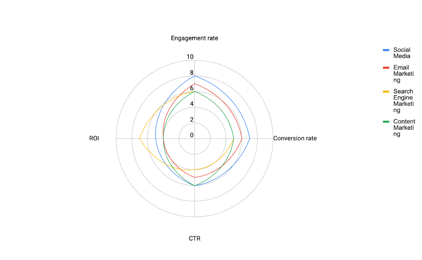
Radar charts
Also known as spider or polar charts, they display multivariate data on a two-dimensional plane. These charts provide a clear overview of variations across multiple variables, making them suitable for visualizing diverse datasets.
Imagine a digital marketing manager who wants to evaluate the performance of their marketing channels, which include social media, email marketing, search engine marketing, and content marketing. They want to compare different metrics such as engagement rate, conversion rate, click-through rate, and return on investment to determine the strengths and weaknesses of each channel.
By utilizing a radar chart, the digital marketing manager can easily compare the performance of each channel across these metrics and identify areas that require improvement or optimization. This type of chart provides a comprehensive overview of the performance landscape, which could potentially aid the person in making any strategic decisions.
When to use radar charts:
- You want to compare multiple variables on a common scale: Radar charts can be used to visually compare the values of multiple variables across different categories or individuals.
- You want to identify strengths and weaknesses: Radar charts can help you identify areas where a particular category or individual excels or falls short.
- You want to communicate complex data in a simple way: Radar charts can be used to communicate complex data in a visually appealing and easy-to-understand format.
When to use another data visualization:
While radar charts are a powerful tool, they may not be the best choice in every situation. Consider using other visualizations when:
- You have a large number of variables: Radar charts can become cluttered with a large number of variables, making it difficult to interpret the results. If you have a large dataset, consider using a line chart or a bar chart to compare individual variables.
- You want to compare precise values: Radar charts are not as precise as other visualizations when it comes to comparing exact values. If you need to compare precise values, consider using a line chart or a bar chart.
- You want to show changes over time: If you're tracking data that evolves over a period, a line chart might be more appropriate for visualizing trends.
Related reading: All about data visualization
Data visualization tools
So far, we’ve looked into various data visualization techniques, principles and chart types to understand how to illustrate your data. Most examples in this article have been created directly in Google Sheets for simplicity. Yet, a whole world exists within data visualization and analytics that will help you.
Today, there are many options available for data analysts and marketers. Some established data visualization software players are tools like Qlik, Tableau, PowerBI, Spotfire, IBM, and SAP, which compete alongside robust open-source alternatives like Gephi, RAWGraphs, Plotly, and Datawrapper.
Open-source tools may seem attractive due to their cost-effectiveness, but they often require a significant time investment and some developers to help with implementation. As for solutions provided by the big software companies, which are driven by the need to continuously innovate, they all come with associated costs as well as an initial learning curve on how to use them.
When selecting data visualization tools, it's essential to consider the narrative intended to be conveyed through the data and the message aimed at the target audience. Business intelligence (BI) designers can tailor their choice of tools to align with their intended audience's specific needs and preferences.
Understanding the end-users of the dashboard is paramount in determining the most appropriate data visualization approach. Designers must empathize with users, recognizing that what resonates with an executive in a corporate suite may not be effective for frontline digital marketers. By prioritizing user-centric design, BI designers can ensure the efficacy and relevance of their data visualization endeavors.
Small organizations without Business Intelligence (BI) resources can use free tools such as Looker Studio or Funnel to visualize their data quickly. Suppose you use a marketing intelligence platform like Funnel – n that case, you can benefit from having all your data already available, making it much faster and easier to set up basic dashboard visualizations.
Related reading: The best data visualization tools
Applying design principles to your marketing dashboard
With any kind of data visualization, you need to be selective. Data is all around us, and you can easily overwhelm yourself and your boss if you don’t figure out the most important thing they need to see.
Essentially, you want to achieve a consolidated view of all your data to help you monitor your marketing and act accordingly if you start missing targets. In this respect, a dashboard merely represents the most critical information required to achieve one or more marketing objectives.
How information is visually presented is vital to how we perceive and comprehend it. Several factors affect the information hierarchy in a layout, such as size, color, contrast, alignment, repetition, element placement, whitespace, style, and texture. Larger visual elements, such as fonts or images, naturally draw more attention than smaller ones, while vibrant colors stand out more than muted ones. Careful object alignment can also bring order to what may otherwise appear chaotic.
Modern dashboards often follow minimalist and clean aesthetics, with flat design being a prevalent trend. Awareness of these basic design principles and guidelines can help you create effective visualizations and a better dashboard, leading to better overall content comprehension.
Remember, the key elements of a dashboard typically are to:
- Display information relevant to helping you achieve a specific objective or goal.
- Provide you with a holistic, easily digestible view of what’s happening.
- Contextualize or compare performance over different periods - days, months, or years.
- Empower you to monitor and act quickly and easily.
Simply put, a poorly designed and cluttered dashboard can confuse your boss when they're trying to make sense of data. That's why it's crucial to follow some basic principles of design and data visualization skills to create a dashboard that's both visually appealing and easy to understand.